Colour sets the tone of any design, it has meaning and transmits different feelings (Yaroslav Lakovlev). There are many ways to pair hues, tones and shades to create a palette for your design.
Good example
The School For Good Mothers by Jessamine Chan
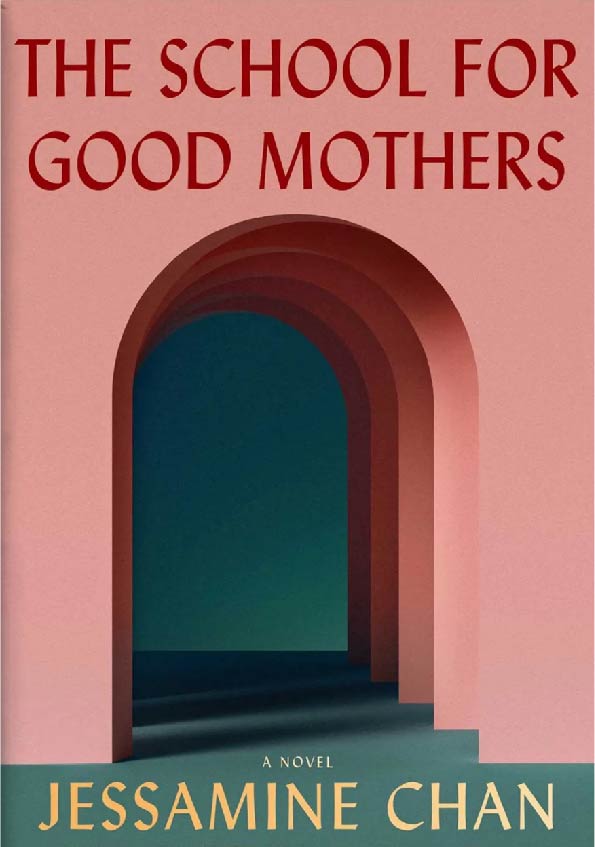
The School for Good Mothers book cover jumps out at you because of the complimenting hues and tones, and the contrast involved. The altogether look is smooth and unique.
Firstly, the designer has picked two main colours; pink and green. The pink is more of a coral pink and the green is a deeper forest green. These two hues complement each other on the colour wheel. Now the story behind this cover is about a bad mother rehab. The theme of mums is played heavily in the colour palette. The gentle pink is delicate and delicate, representing feminity. The green showcases rebirth, growth and overall nature. Mother Nature.
The natural colours create a comfortable atmosphere to the design which plays well into the theme of mothers. There’s great contrast fabricated here, the pink is a warm tone while the green is cool, and this balances out the layout. The text on the design incorporates different colours, the above text of the book title is red which is a warm tone. This text is layered over the pink, making it easy on the eyes because the two hues are similar and warm. However, the yellow text at the bottom of the cover is overlapped with the dark dark green colour. Since the yellow text is a warm tone layered on top of the green, it makes the text pop and adds affection to the area.
There are lots of different shades, tones and tints associated with the two main colours. This fabricates a 3D effect and creates different shapes within the layout. All using colour. The shadows and highlights make it look as if sunlight is hitting the frame of the outside doorway, along with the gradual darker shading inside the archways. This emphasises the 3D look.
Bad Example and Redesign
Ninth House by Leigh Bardugo
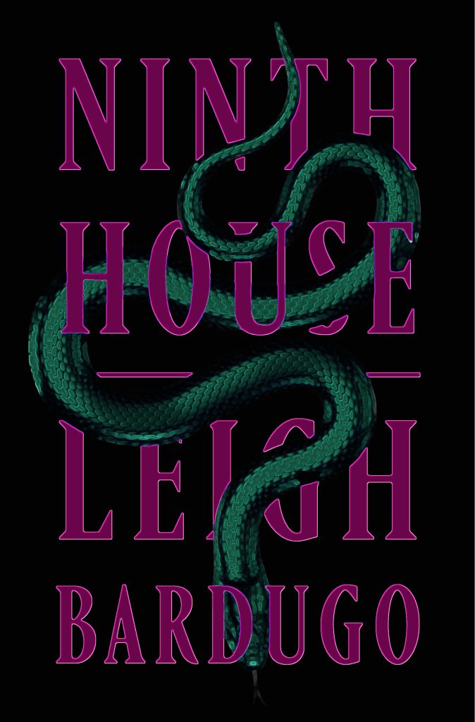

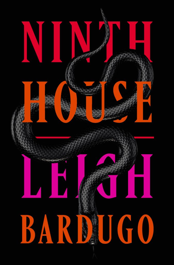
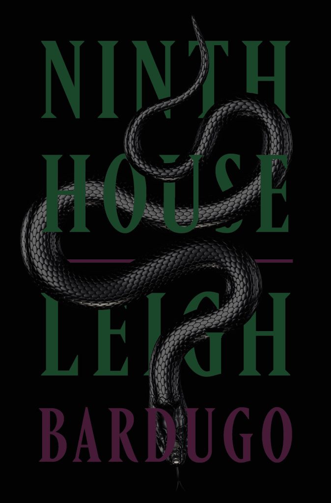
The monochromic book cover of Ninth House needs some colour added to make for an enthusiastic design. While experimenting with different colour combinations, the mix of the black background with a dingy green and purple keeps that sombre style while making it more striking.
Using deep purple for the text on the design against that black background fabricates an atmosphere of mystery along with sophistication. The book is about a traumatised University student who can see ghosts, we need to understand this to know what style and feeling to convey in the design. In juxtaposition, the shaded green represents hope and forgiveness, showing the journey this character is going through. However, because the green is placed on the snake it creates a more sinister feel to the design, which plays well within the theme.
The complementary shades showcase colour harmony that delivers visual interest and a sense of order (pens pencils paint and paper). The original design is shades and tints of black, fashioning a bland look. There is great contrast with the combination of the cold green and warm purple, but also, the black background empathises these colours.
The layout is clean and amazing but loses its potential with the choice of black and white. The added colours in the redesign bring that potential out. It will stand out more on a poster or in any advertising.
I added highlighted edges to the text to keep the type at the top of the hierarchy and created a more 3D effect.
In my design progression, I only added colour to the font on the design but felt that the grey snake cascading in front of the type took away from the overall look. Choosing to change the snake makes the final image noticeable.
Design Progressions
References
Bardugo, L. (Undated) Ninth House [Blog post]. Leigh Bardugo. Available online: https://www.leighbardugo.com/book/ninth-house/ [4/11/23].
Lakovlev, Y. (Undated) How to use Color Theory in Graphic Design [Blog post]. Zeka Graphic. Available online: https://www.zekagraphic.com/full-guide-to-learn-everything-about-color-theory/ [4/11/23].
No Author (2016) THE COLOUR WHEEL – GREEN AND PINK. REFLECTIONS AND STUDIES OF INTEREST – COLOUR [Blog post]. Pens Pencils Paint and Papers. 6 September. Available online: https://penspencilspaintandpapers.wordpress.com/2016/09/06/the-colour-wheel-green-and-pink-reflections-and-studies-of-interest-colour/ [4/11/23].
Rios, R (Undated) 9 color palettes based on beautiful book cover design [Blog post]. Webflow. Day Undated. Available online: https://webflow.com/blog/book-cover-design-color-palettes [25/10/203].