Composition is based on breaking up your visuals (Bookdesigners). Every element is paramount in any design. It involves a hierarchy, scale, repetition, negative space, contrast, symmetry and proportion.
Good example
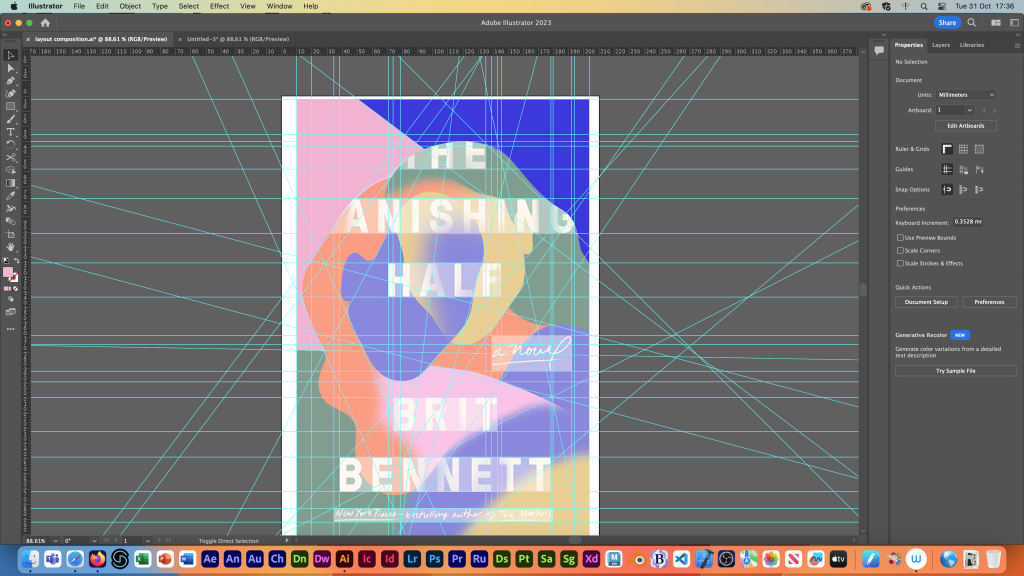
The Vanishing Half by Brit Bennet

The book cover of The Vanishing Half is striking and uses composition in a more complex way.
The first thing your eyes land on is the vague-shaped faces and all the other shapes that are repeated throughout the cover design. This adds consistency to the layout. Having the title in front of the vacant faces draws your focus even more to the title, creating a hierarchy with the text illustration. Even though the title and the author’s name use the same typeface and size, you’re still drawn to the title first because of the blended profiles. Then to the author’s name at the bottom of the cover.
The other thing that’s striking is the contrasting colours, there’s five different colours, some are in a brighter tone and others are darker. The same goes for the mixing of warm and cool colours. All these choices the designer makes with colour portrays contrast, levelling out the frame and creates balance. Theres more contrast fabricated in the lines of the shapes and text, some edges of the coloured shapes are blended into others, whilst some stay sharp. The designer did this subtly and softly producing balance, not going overboard which would’ve taken away from the overall equality the design portrays for each element.
Finally, this book cover has a small amount of negative space but because the small fragment of negative space is duplicated all around, it creates a good amount of room to breathe and to let the design speak for itself. The designer made the composition work even though they may have broken one of the rules, which is okay in some circumstances.
Compositional Layout
Using Indesign for this book cover I added guidelines using the ruler tool to showcase all the leading lines and shapes that make up that composition.

Bad Example and Redesign
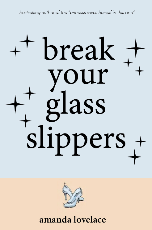
Break Your Glass Slippers by Amanda Lovelace
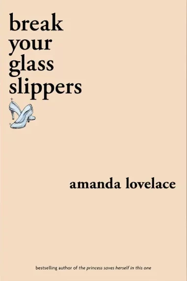
This book titled Break Your Glass Slippers goes against the rules of composition, which is okay if executed correctly, but this isn’t. The book title is squished into one corner and the overall look is bland.
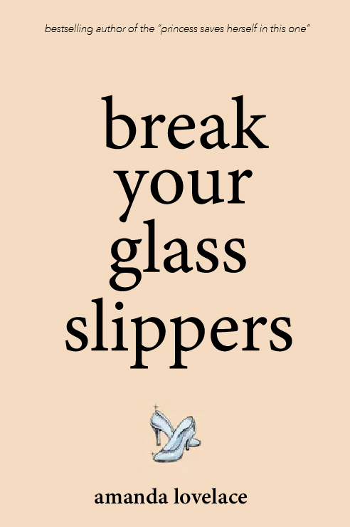
In the redesign, I aimed for a traditional compositional method by centring everything into the middle. Doing this makes the cover more striking and bold, which is important in a book cover. I fabricated a clear hierarchy with the placement of text, using the same font (minion variable concept in regular) with the book title and author name. The book title is bigger and bolder than the author’s name so the viewer notices that first as it is the most important on the design. Centring the book title in the middle keeps it at the top of that hierarchy and eye level for the viewer. There’s an unsettling amount of negative space in the earliest cover, along with too much of one colour generating a blocky style. To break this up I added a light blue rectangle to the top portion of the cover, leveling out the cover.
The rectangle is the same tone of blue as the glass slipper. These two colours in the layout complement each other and add much more contrast by including a warm and cool tone. This creates balance throughout. Adding that rectangle makes the overall cover more distinct and would stand out much more on display.
Centring everything in the middle of the frame produces symmetry and proportion, this relaxes the appearance of the cover, compared to the first design that created asymmetry along with too much negative space. This just fabricated an odd tension to the design.
Design Progress
First Design and Last Design
References
Denn, R (2020) ‘The Vanishing Half’ is a compelling novel on race and home [Blog post]. The Christian Science Monitor. 10 June. Available online: https://www.csmonitor.com/Books/Book-Reviews/2020/0610/The-Vanishing-Half-is-a-compelling-novel-on-race-and-home [25/10/2023].
Endacott, A (2020) Review: Break Your Glass Slippers by Amanda Lovelace [Blog post]. The Nerd Daily. 9 March. Available online: https://thenerddaily.com/break-your-glass-slippers-amanda-lovelace/ [25/10/2023].
Perhiniak, S. (2020) The most important compositional principles in graphic design [Blog post]. Yes I’m a Designer. 16 May. Available online: https://yesimadesigner.com/composition-techniques/ [Accessed 25/10/23].
Tempone, D. (Undated) What is Composition in Graphic Design [Blog post]. Domestika. Available online: https://www.domestika.org/en/blog/9103-what-is-composition-in-graphic-design [5/11/23].
Ian. (2021) Five Things that Make the Magic Happen [Blog post]. Book Designers. 27 July. Available online: https://bookdesigners.com/blog/what-makes-a-good-book-cover#:~:text=Composition%20is%20based%20on%20breaking,element%20to%20bring%20focus%20to. [5/11/23].