In this blog, I’ll be explaining the thought process of conceptual design, and how it links to the theme of each book. In this case with book covers, this includes “the art of conveying an entire manuscript into a single image” (Penguin Books).
Good Example
The Memory Police by Yoko Ogawa

The book, The Memory Police, is about a woman who lives on an island where everyone is starting to forget everything and everyone. This is important to note as the design conveys this well.
Personally, I’m not a fan of book covers that include photographs as it limits creativity as a viewer of cover design but also as a reader. However, in this instance, it works well as it adds great purpose to the layout and storyline. The photograph of the woman is constructed like a mug shot, tied to the police in the book title. The designer adds dotted grain to the image, making the features of the woman not unrecognisable but faded. It’s just the beginning of the amnesia-ridden island.
The violent scribbles encasing the figure’s face, having been torn out and stuck onto the photograph, show the severity of forgetfulness in this story. To the point where some of her features are barely distinguishable. The urgency of the ripped paper adds to the worry the characters must feel in this novel. This shows great conceptual design as it has been thought about thoroughly and the meaning behind the design isn’t clear until you understand the story.
The contrast of the grey, shaded background with the bright orange of the child-like squiggles makes the book cover pop with the colour. This projects different emotions of urgency and hopelessness from both these pieces.
Another design choice that adds to the police element is the book title encased within a police badge with the police’s logo covering one eye of the woman. This portrays the blindness that is happening to everyone on this island.
Overall, the design is unique and thought-provoking, especially having the book title in such a small portion in small lettering, but because it’s so interesting it still catches your eye. The book cover of this “design is the window into its story” (Penguin Books).
Bad Example and Redesign
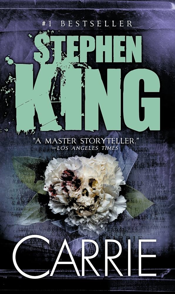
Carrie by Stephen King
This book named Carrie by Stephen King, is a poor showcase of conceptual design. The design doesn’t show us anything conceptual other than a gothic style. Like in the previous book cover, this one uses photographs, but this is an example of how to execute it inadequately. It shows nothing about the story or what the book is about. There’s not much though in the construction of this piece.

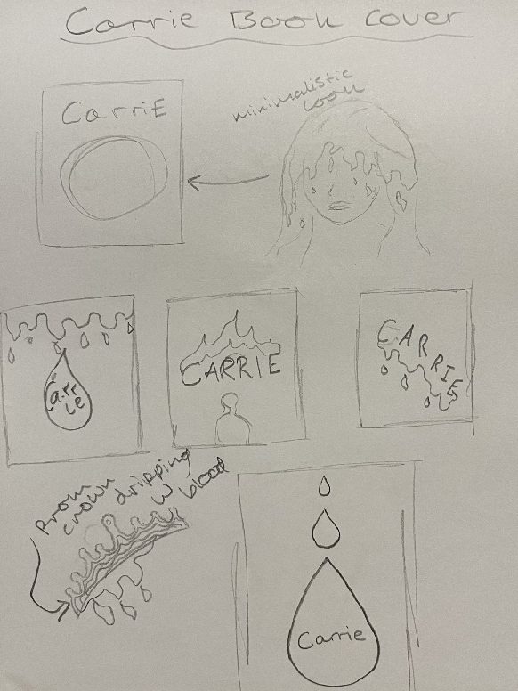
For the redesign, I decided to start from a blank canvas as the original cover has too much imagery blended into one another that I won’t use. The story behind this cover includes a bullied schoolgirl (Carrie) who discovers she has supernatural powers. One infamous scene from this story is when the schoolgirl goes to prom and ends up drenched in blood by her school bullies. The idea for this book cover will incorporate all the main points the story is about and that pinnacle scene.
Firstly, using a very dark-toned red background and shaded reds for the colour palette. The application of these tones creates a dingy and sombre atmosphere.
The main features of the conceptual design here include the floating silhouette, representing the high school girl from the story. The figure has subtle features showing her hair and prom dress. Positioning the body in a way to show Carrie is floating, with her arms and hands spread apart and her feet pointed down. Linking the idea that Carrie has developed these newfound powers. The outlined dress and flowing hair illustrate her presence at prom.
The other major characteristic is the water droplet, situated behind the silhouette. Colouring this shape in different shades of red represents a blood droplet and a spotlight that’s forced on the character during this scene. This character in the story has a moment of grotesque limelight when they get blood chucked all over them.
I kept all the negative space around the figure and droplet shape. This emphasizes the attention this character felt during this act, being outcasted because of the way she is.
Finally, I added a grain effect to the overall design to further fabricate that solemn ambience. This added effect is subtle, to not take away from the overall design. Altogether this design “speaks for itself” (ByAbi).
Design Process
References
Fawcus, A. (2018) What is a Design Concept? [Blog post]. Byabi. 2 October. Available online: https://www.byabi.co.uk/website-designer-suffolk/what-is-a-design-concept [25/10/2023].
No Author (Undated) Carrie [Blog post]. Stephen King Wiki. Available online: https://stephenking.fandom.com/wiki/Carrie. [25/10/23].
Penguin Books (Undated) How are Book Covers Designed [Blog post]. Penguin Books UK. Undated. Available online: https://www.penguin.co.uk/articles/company-article/how-book-covers-are-designed [3/11/2023].
Worm, B. (2020) Booker International Longlist 2020: The Memory Police by Yoko Ogawa [Blog post]. The Readers blog. 9 May. Available online: https://thereadersroom.org/2020/03/09/booker-international-longlist-2020-the-memory-police-by-yoko-ogawa/ [3/11/2023].