Typography is the art of digital lettering; type has a rhythm, just like music (Simon Garfield). Every little detail in typography matters, typefaces can create many different emotions and have vast personalities. I will present two different book designs focusing on typography, one a good design, and one a bad design that I’ll be redesigning.
Good Example
The Swallows by Lisa lutz
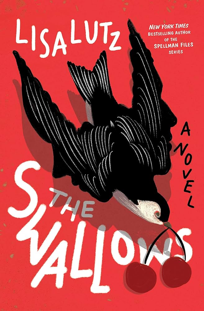
The typography of The Swallows book cover is very well done. The layout is clean and effective in its purpose. The book is about a teacher, so the theme is schools. This is important so we understand the designer’s choices and theme.
Firstly, the typeface choice works well for the theme of a teacher. It looks soft and like it was handwritten on a whiteboard, giving a vision of what the book is about. The sans-serif typeface has a big emphasis on the smooth curve at the end of each stroke. Creating a gentler style, running in theme with the school subject matter. The designer chose an easy typeface to read, making it clear to the viewer.
The placement of each letter within the title has been adjusted. The designer has slanted the text along with the curves and movement of the bird, this is also true with the rest of the text on the page as well. The choice to elongate the second “L” in “Swallows” makes the text more playful and stand out. The typeface is the same for the author’s name, title, and type of book: the weight and size of this text present what’s important to read first on the cover, creating a hierarchy. The title is much heavier in weight and larger in size. It takes up a lot of room in the design to make it eye-catching and easy to read. The kerning is squashed together in the title, compared to the rest of the text on the cover where the kerning is more spread out. This fabricates a bolder look and contrast of each text line and emphasises that title even further.
The bird on the cover has given the text purpose in placement as each letter sweeps along with the bird’s movement. Making the overall design very sleek, showing the thought that went into it. Having only three colours for the cover makes for a distinct and clear style for the book, not to overwhelm the reader.
Bad Example and Redesign
One Flew Over the Cuckoo’s Nest by Ken Kesey
Secondly, I have picked a bad example of typography on a book cover design. I have then fabricated a new design for the book with improved typography and here’s the process.

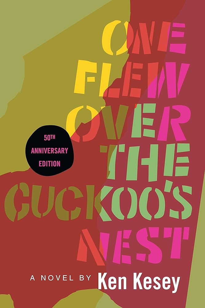
The book One Flew Over the Cuckoo’s Nest is a representation of poor typography, the text doesn’t jump out at you and just blends into the background. Overall it looks messy.
With my redesign, I aimed for something simpler, as the original layout is chaotic and not so easy on the eyes. The goal was minimalism with an easy-to-read typeface, after all, words are to be read – end of story (Simon Garfield).
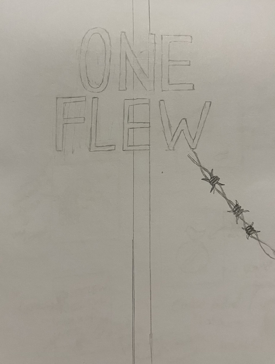
I used one secondary colour of orange so I could focus more on typography. I did want to add a design which I did with the barbed wire as well.
In Adobe Illustrator, I chose the font “Ador Hairline” in extra bold italics for the book title and the same typeface for the secondary title but in italics, to not draw attention away from the heading. Choosing this font to fabricate a much simpler and readable text, compared to the original font used; the sans-serif font is straight to the point. I decided to choose the colour black for the font, to keep it more coherent and center-stage. The extra-bold font emphasises this aspect. Doing this retaliates against the initial book cover which includes vast amounts of colour that bleeds into the background, making the title less eye-catching than it could be.
The original book’s typography is aligned to the right side of the book cover, filling up most of the layout. This isn’t a bad thing to do, however, given the font the designer used and all the muddy colours, it creates a tangled and child-like look. To fix this I decided to play with the text placement, giving it more movement around the barbed wire.
When it came to the font, I adjusted the kerning to be more even and wide from what it initially was to create balance. Then, using the ruler tool, I created guidelines between each line. Fabricating even kerning, a bit wider apart, so it’s not squished together.
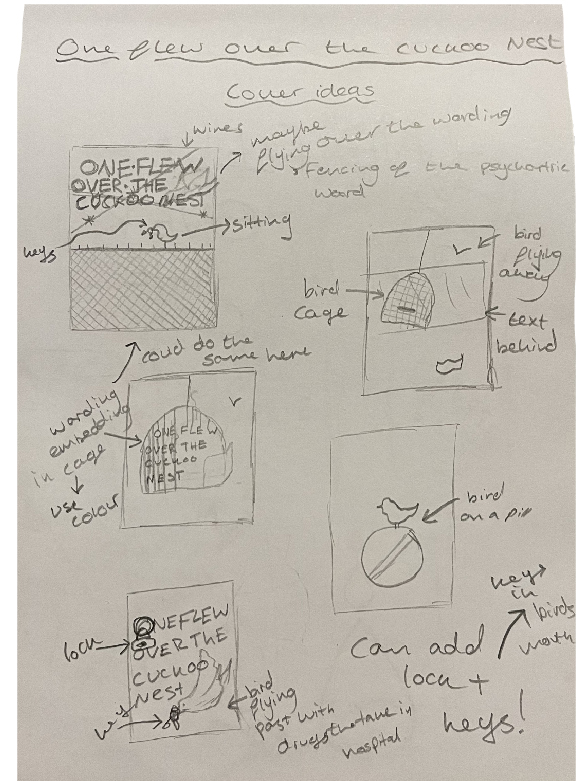
Design Process
References
Garfield, S. (2010) Just My Type: a book about fonts. London: Profile Books.
Hendy, V (2020) EMILY OSBOURNE ON DESIGNING THE SWALLOWS [Blog post]. Spine Magazine. Undated. Available online: https://spinemagazine.co/articles/emily-osborne#:~:text=Emily%20Osborne%20is%20a%20graphic,process%20for%20designing%20The%20Swallows. [25/10/2023].
Service95 (undated) One Flew Over the Cuckoo’s Nest [Blog post]. Service95. undated. Available online: https://www.service95.com/books/one-flew-over-the-cuckoos-nest/ [29/10/23].