In this blog post, I will be designing typographical logos that have something to say about me. I’ll be focusing on layout and the use of typefaces.
Amy Waudby Logo
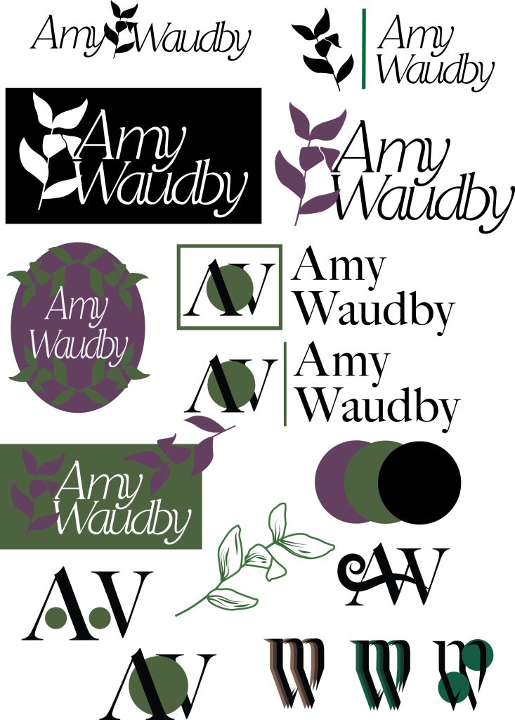
For this logo design, I focused on a simplistic and lucid construction.
Using my full name, I worked with the Restora typeface in thin italics. This font resonates with me because of its playful but elegant style. Setting the ambience for the whole logo. I adjusted the kerning of the letters so that it was all connected, fabricating joint-up writing. This makes the font look more human and fashionable.
I designed an unembellished form of a plant, representing how important nature is to me and how we should be much more respectful to Mother Nature in all aspects.
I have two versions of this logo. The first one is a simple black and white to showcase how differently it can used. The other version of the logo has no border like the other. My name is inked black for easy readability and I’ve coloured the plant a sombre purple which is an elegant and lovely colour but also consititues to my life ambitions.
Old-Worldly Typographical Logo
I engrossed myself in experimentation and inspiration for my second logo design. Here I was influenced by the old-worldy design of pubs and coffee shop signs. A style I admire and enjoy the history of.
Using my full name again, I fabricated an oval shape and curved my full name around the shape. To add more influence and detail, I assembled a simple design for my initials in the middle of the logo. I included details of that same leaf imagery I used in the last logo but with extra aspects and thinned out. This was to not take away from the overall look.
The choice of variant shades of dark green stems from my love for nature but it also creates an ambience of serenity and positivity which are important points of life I aim for myself. These sombre tones add to that old-worldly fashion.
Design Progress
Here are different designs and ideas I had for these logos and the devlopment of them.