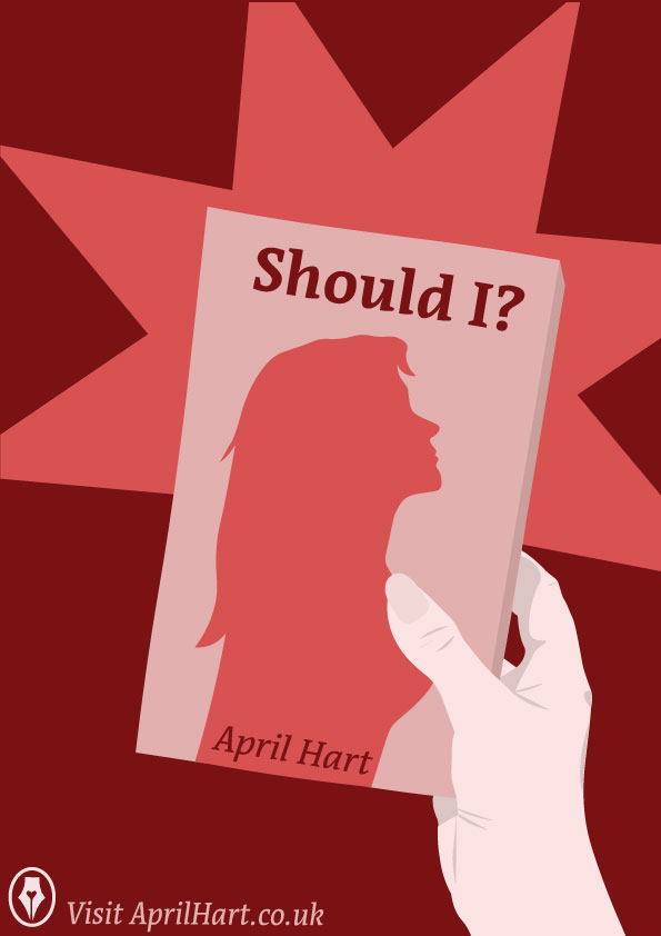
These cover spreads I have designed for the April Hart brand, are all promotional pieces. All three cover posters work very well together and have a story when they are placed with one another. However, they work just as well by themselves as well at promoting April Hart.
These posters can be used physically on the wall of a bookstore, coffee shop or library. Picking the right spots to put your promotional pieces. They will also work just as well online as ads on social media or online bookshops. Online promotion would be key to pushing people towards the April Hart website page.
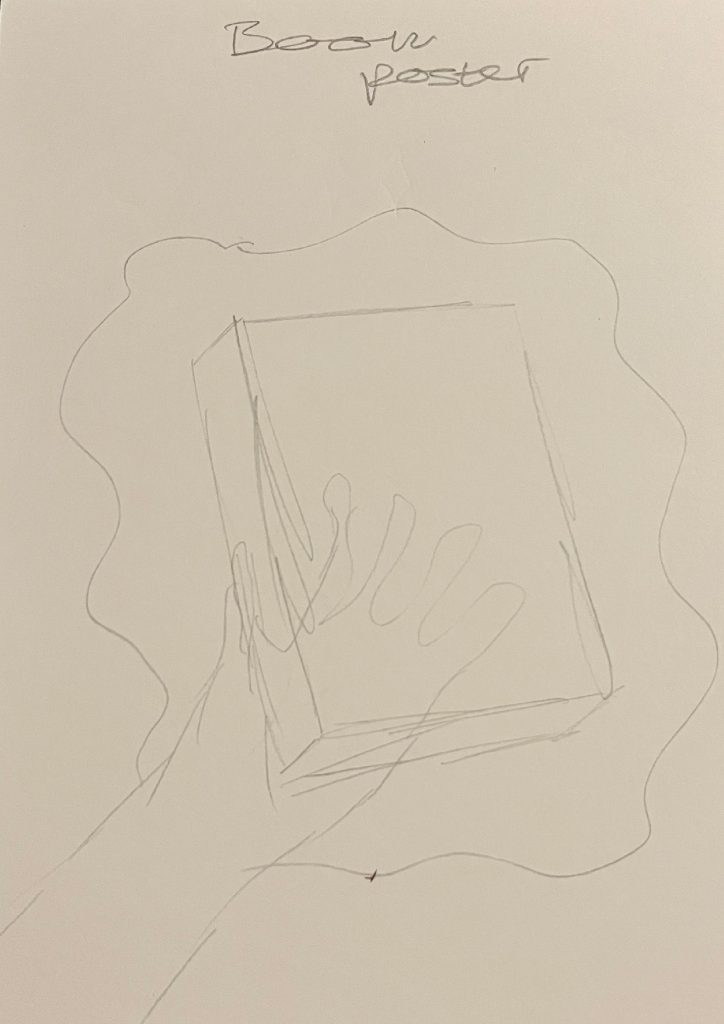
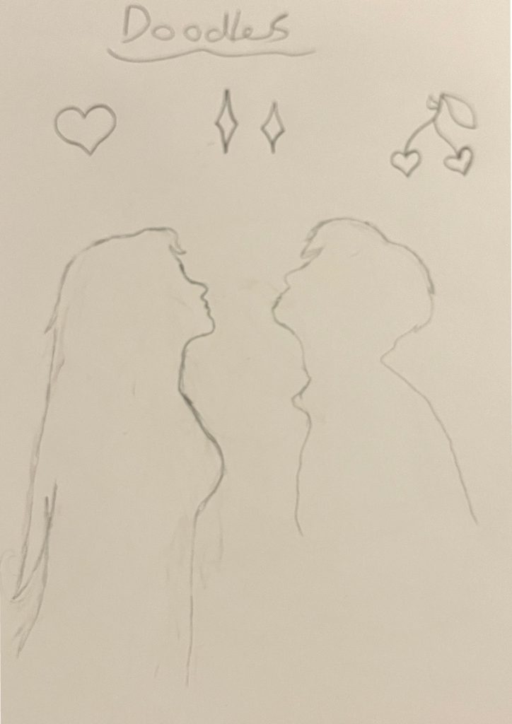
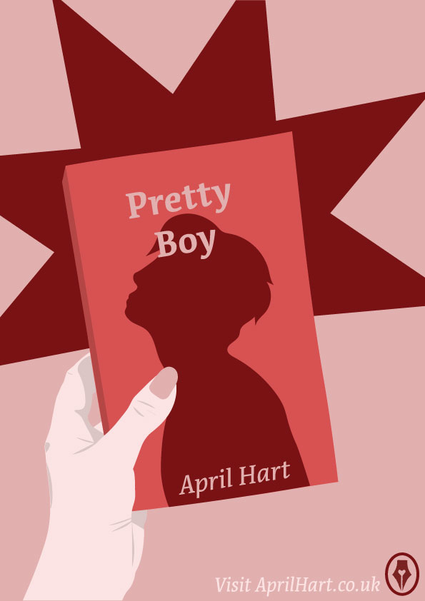
When designing the book promotional posters, I sketched out the idea first. I then photographed my own hand with a book in it to use as a reference when drawing it out. The style of design is the same simple but entertaining and soft style I used in previous April Hart works. With added little details. These two posters are promoting two different romance books, both with a silhouette, one a man, and one a woman. They both look up, hopelessly looking for one another. The idea of a romance book comes across very strongly from this design so the viewer knows what they are in for when exploring for more.
I purposely wanted the left poster to involve more of the lighter colours from the colour palette. While the poster on the right includes more of the darker red. This creates a great contrast between the two, adding the lonely feeling of how far away they are from one another in the stories. For these two similar posters, I used the conceptually designed logo in the corner of the poster. This proves how having a more simple-looking logo doesn’t take away from the design but lets people know how it is.
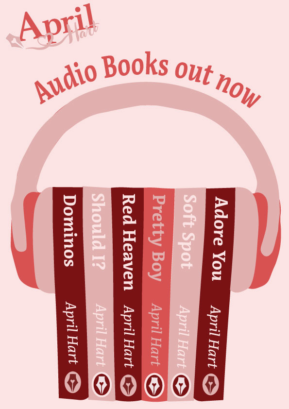
The audiobook poster that is wedged in the middle of the book poster is the focal point. They connect well together. A person’s hand takes a book away from the stack to read from either side. while promoting the audiobooks so those headphones are secured in place between the current books. This poster shows off many of April Hart’s books in a more accessible version for anyone. The colours used for the audiobook posters just included warm tones. Only the pinks and single red, make it jump out to the viewer and still look mellow and gooey. For this layout, I took a photograph of a bunch of books and my headphones. Then using it as a reference to draw from in my blocky, fun style.
Overall, the three promotional posters work wonders together or apart. They can be used in the street or on your phone, making them vastly universal.
Design Progressions
