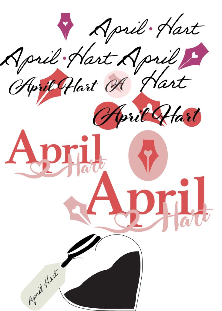
For my logo design, I focused on the author’s brand. The made-up author April Hart has a brand of community for young adults (mainly women) creating warmth and fun. The different logo variations are light-hearted but to the point. This is to show off a more fun side of writers and reading.
The typography logo of the author’s name “April Hart” uses a big but slim serif font for her first name April, while her second name is in a handwritten font. I styled it in a way that the second name is written on top of the first name in a signature style. The use of this joint font for “Hart” is to add a feminine and amusing feel to the logo. Adding to April Hart’s brand of being fun and welcoming. Curling the beginning of this font to create a love heart emphasises the romance aspect and the fun-loving vibe. I chose to use the dark red and the pastel pink for this logotype. Fabricating contrast with the colours while keeping it warm and comforting to the viewer. Not wanting to overcomplicate the look I stuck with just the two colours.
Along with the main logo being the author’s full name, I wanted this author to have something extra to her brand. I designed an illustrated version of her logo conceptually. Bringing love and writing together. Having a simple logo like this stamp-like logo makes it easier to the author’s logo anywhere without it looking misplaced on a design.
For the conceptual logo, I went for a more classic design of an old-fashioned fountain pen with an ingrained love heart within it. This integrates the idea of romance and writing. This fabricates a more joyous and fun element to the rest of the logos and brand. I didn’t want to design anything too complex that would distract from the design of something like a poster or website page. The brand April Hart will use her main typographical logo on things like websites or other social media, while the conceptual design can be used on books and posters. These variations of her logo are important to promote her books and make her more recognisable to the reader and even bookstores. For the colours, I decided to have two of the same logo in different shades. One of the logos includes a deeper red with bright pastel pink as the border and pen, while the other logo uses soft pastel pink with deep red. Very similar but the pink-toned one brings hints of warmth and the red and almost-white pink logo is more cold and pops.
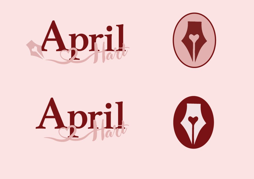
The final portion of my logo designs for April Hart was to combine the conceptual logo and typography logo. They naturally flowed together as I placed the fountain pen at the beginning of the author’s second name. Making it look like the pen had just finished writing her name. This will be the main logo.
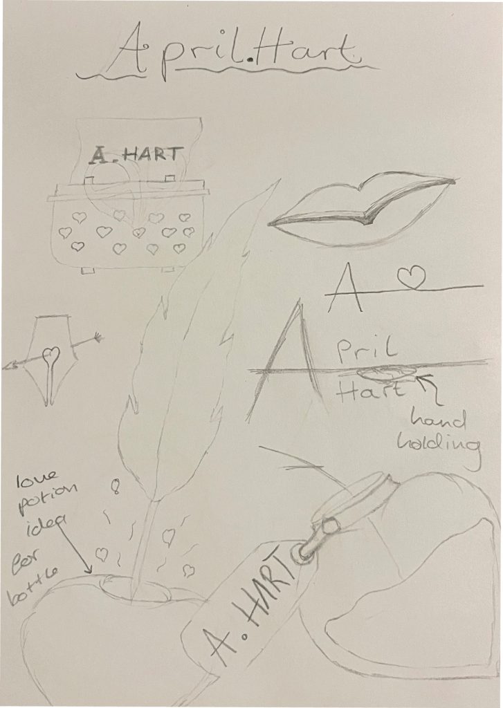
Design Progressions