
For the colour palette, I kept within the theme of the feminity of a romance writer while also centring on the warm and welcoming atmosphere I wanted to create within this book brand. I’ve done this with the kind and girly tones and shades of pink. While adding those two much darker shades of deep red and dark grey to break up those similar colours. Otherwise, they’ll blend into one another in certain designs.
The two pastel and very light pink highlights I have labelled as the background colours set the tones of softness and fun. The addition of the coral pink (a completely different tone to the two background colours) brings that vibrance that’s missing from the other colours. Making it the main colour. All three of these pink tones have a warmth to them, building on that welcoming environment we are creating within this brand.
Finally, I picked two darker shades. A deep cherry red to add mystery but keep with the feminine theme. Also, a dark grey which can be used as a base or for text. These shadow tones break up those lighter and softer colours, fabricating contrast.
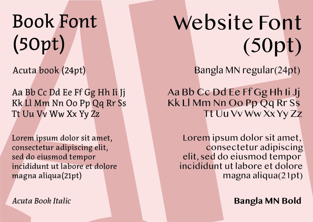
For this typographical graphic standard page, I have focused on the different fonts I will use throughout my designs. I have picked out two different fonts, one for the books and the other for the website design.
For the books, I am using the serif font named “Acuta” in four different versions, book, book italic, bold and normal. I chose this font for the books to keep with that traditionally professional look of books while being easy to read. I plan to use this font for the book cover designs as well.
For the website pages, I have picked the font Bangla MN in regular and bold. This is a sans-serif font that is very clear and easy to read on a screen. It will be easily useable on most backgrounds which is important. I will use the regular version for paragraphs and snippets of information. The bold version will be used for headings.

for the last standard pages, I’m showcasing the different ways I will be using the logo variations. the typography version of the logo including April Hart’s name is much more bulkier. Because of this, the main logo has to be used tactfully to make sure it fits in with the design. I show an example of how to correctly use the logo on the website page layout. The conceptual logo is compact in size and thinner making it a lot easier to place compared to the other logo. This logo can be placed in many different designs. The addition of having it in two different colours, which gives off vast tones, makes it more useable. Here I am showing how to correctly use it on a book page and spine.