The User Experience
For my app/website, I have chosen to do a rock music festival named Wonderless Festival. The festival will be an adult-only festival based in the UK, focusing the people on the music and not the hassle. Capacity will be about 60,000 in the festival (not too big of a festival). There will be camping allowed to keep costs low. It’s set in Manchester, Heaton Park on the 12-14th of July (the weekend). The weather should be nice for the location. Ticket prices will range from £100-300.
The problem space will include all the information about the festival on the website, including tickets, transport, accessibility, line-up, and schedule, all in one place. The app will also have this, but users will use the website to get a secure ticket, transport, and accommodation. Those attending with dietary allergies and requirements like gluten-free, vegetarian, vegan, etc, will be taken into consideration. Users will have the option to collect food and drink at the stalls. Supplying free water and making it clear on the app the locations of water stations. There will be a schedule section where the user can plan when and where their artist is playing next. Having a community section on the website will be important for the audience as they can share their experiences.
The home page should not be too overwhelming with information and imagery. Having all the information on the home page as you keep scrolling down will be easiest to navigate and find. I will use the best-known buttons and options so people will understand how to use the website best. You will not have to log in to access all this information so anyone can use it.
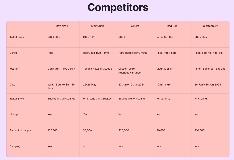
This is all based on reviews I have done of my competitor festivals which I will include below.
Requirement Gathering and Analysis
The audience age falls between 18 and 34 by 46%, according to the data collected at Nielsen’s 2015 Audience Insights Report on Music Festivals. Millennials are the biggest age group. From researching the gender split from multiple articles, its average split is 50/50 for music festivals. Most attendees say they go to these festivals to enjoy the music, spend time with friends and meet new people, according to Statista.
The stakeholders will include the festival attendees. The staff like security, food stalls, and everyone behind the scenes. The family and friends of those attending as well. The police for extra security.
The stakeholders and attendees will think the app/website is successful if all the information they need is in front of them. The app’s map has everything they need, and the timings are visible for each performance.
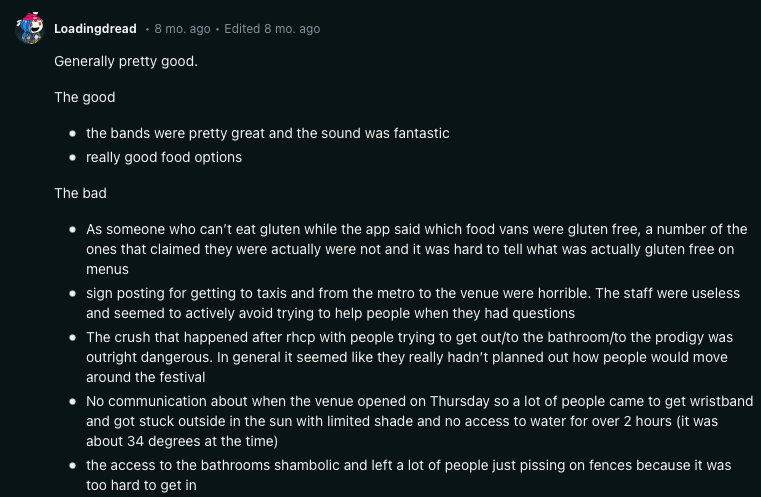
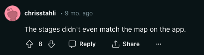
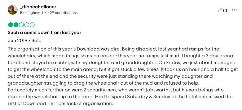
One rock music festival competitor is Download Festival, who have an app. When you first open the app, it bombards you, asking for permissions for different things. The app does not provide anything other than updates, FAQs and information. The layout doesn’t have any hierarchy to it. You can get all this from the website. The reviews from the Apple store reflect that it lacks substance and purpose.
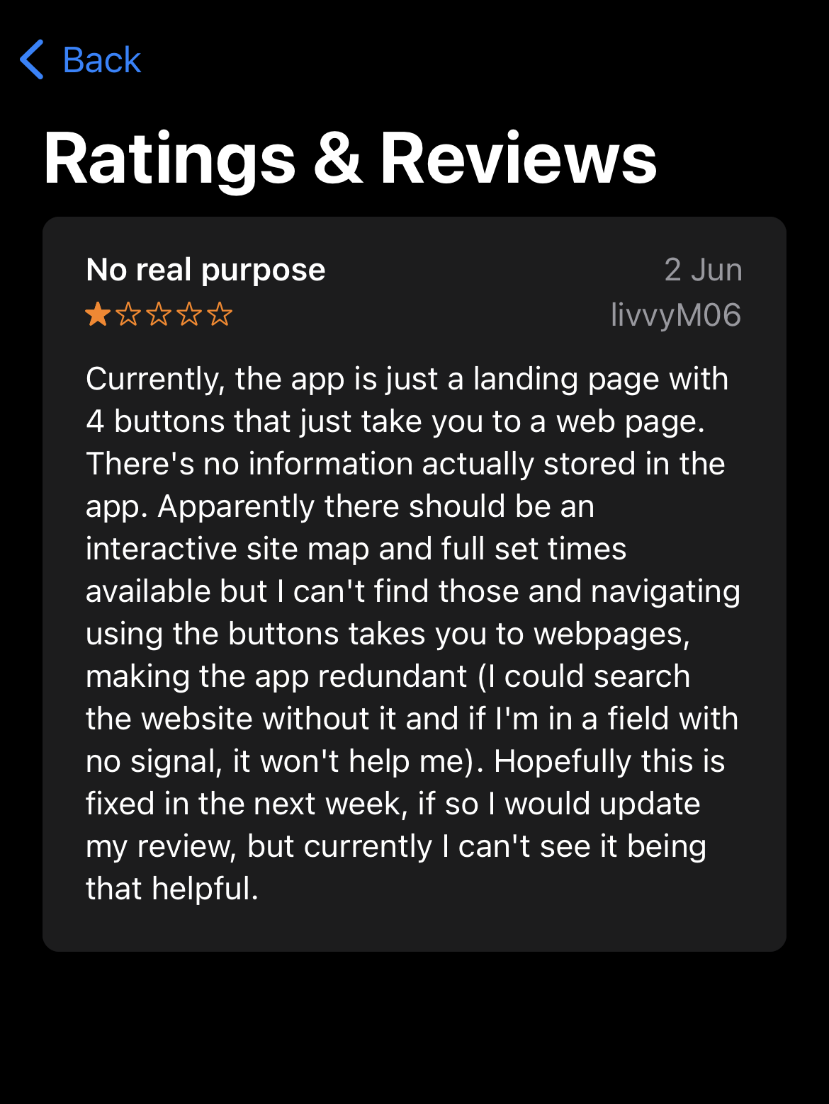
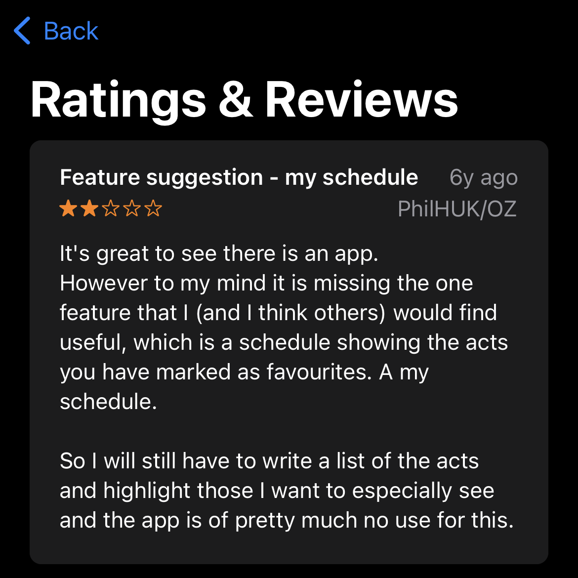
Above are reviews of the Download Festival app. These are very useful in showing me what’s important to the consumer in a Festival app. These reviews aren’t amazed by the app because it’s not useful for them. The most wanted features are a live map they can interact with and a schedule to plan their day. In my app, I will add these attributes and make sure the website and app have different strengths in usage.
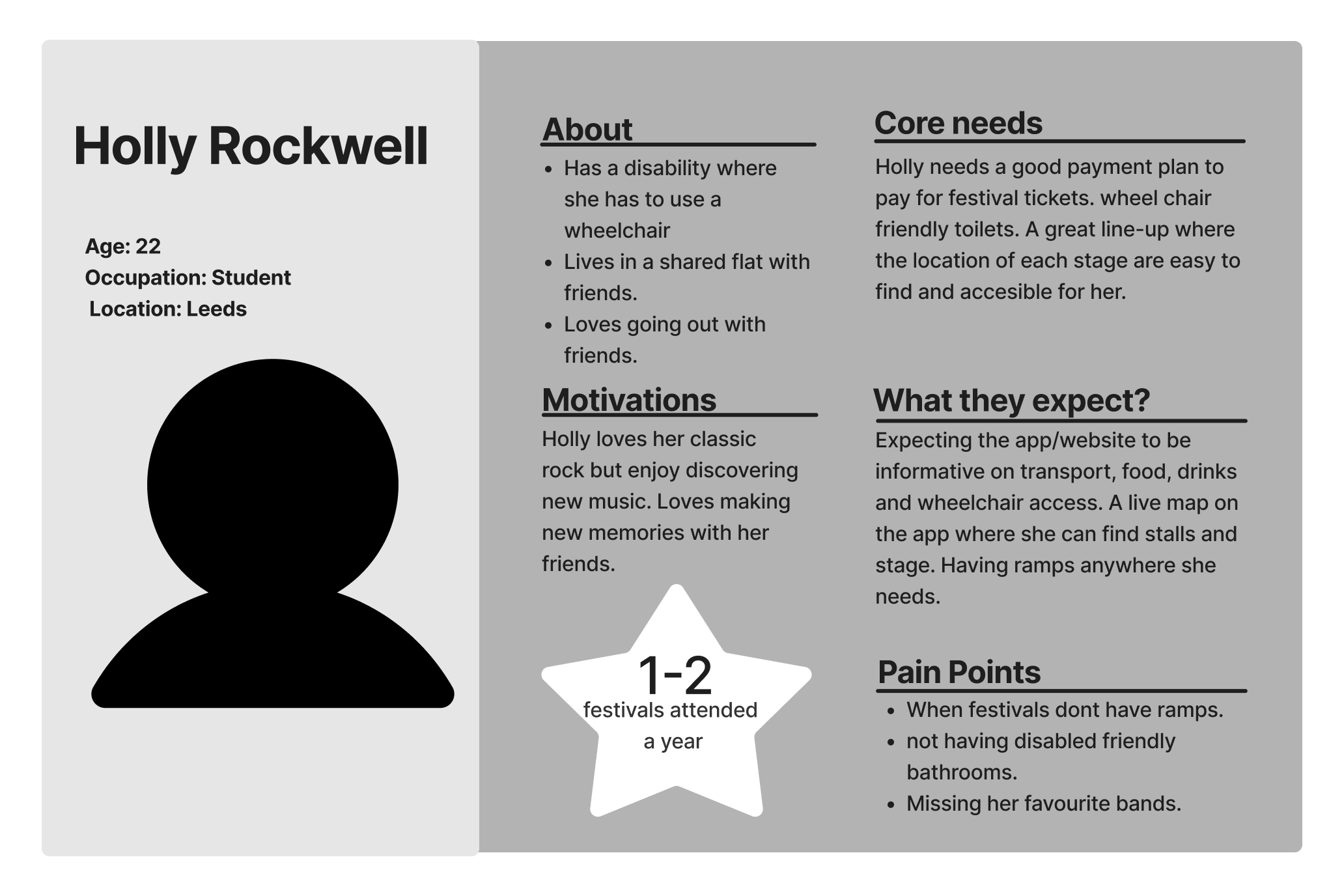
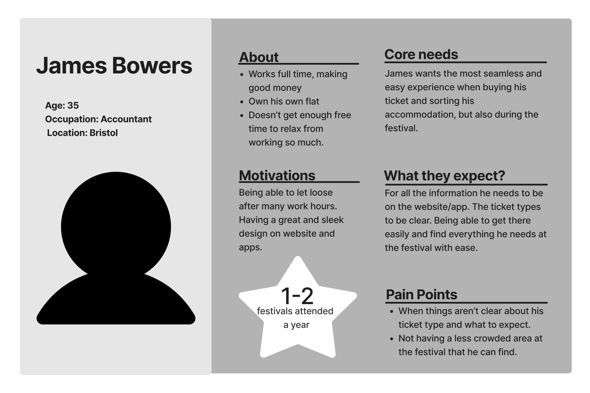
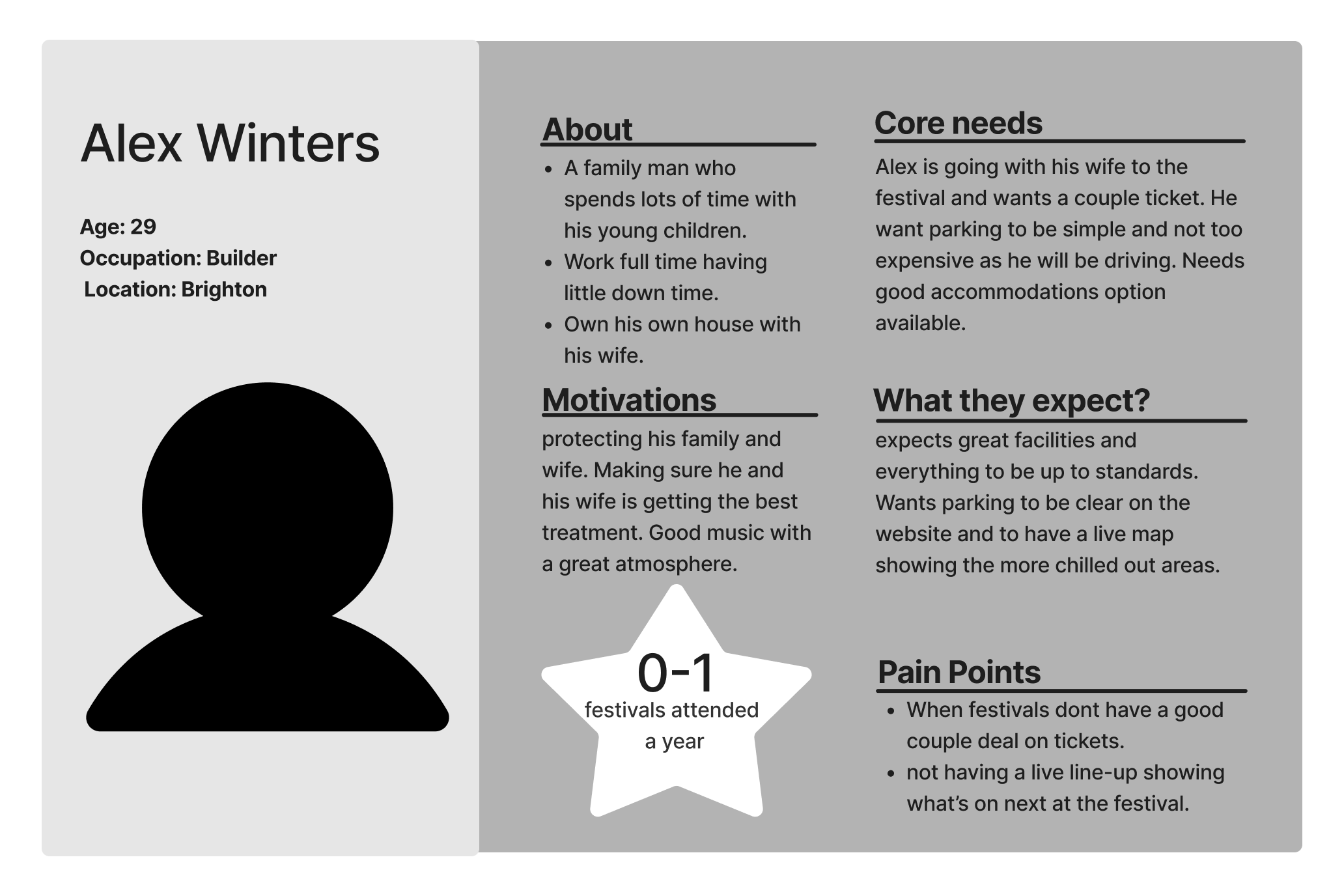
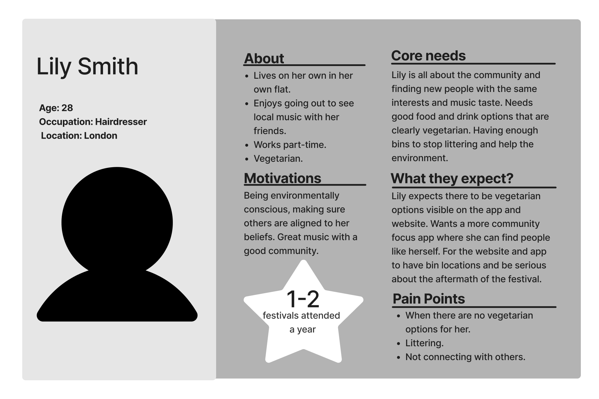
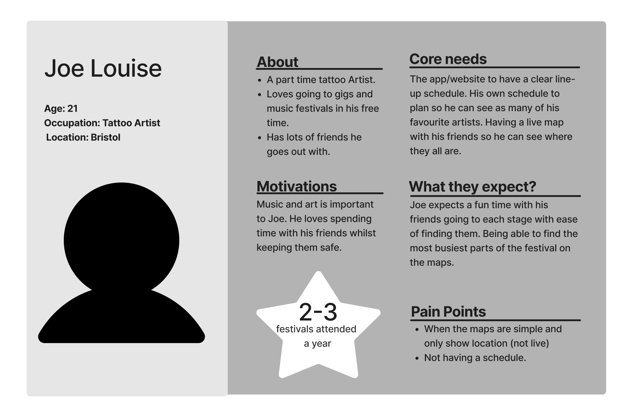
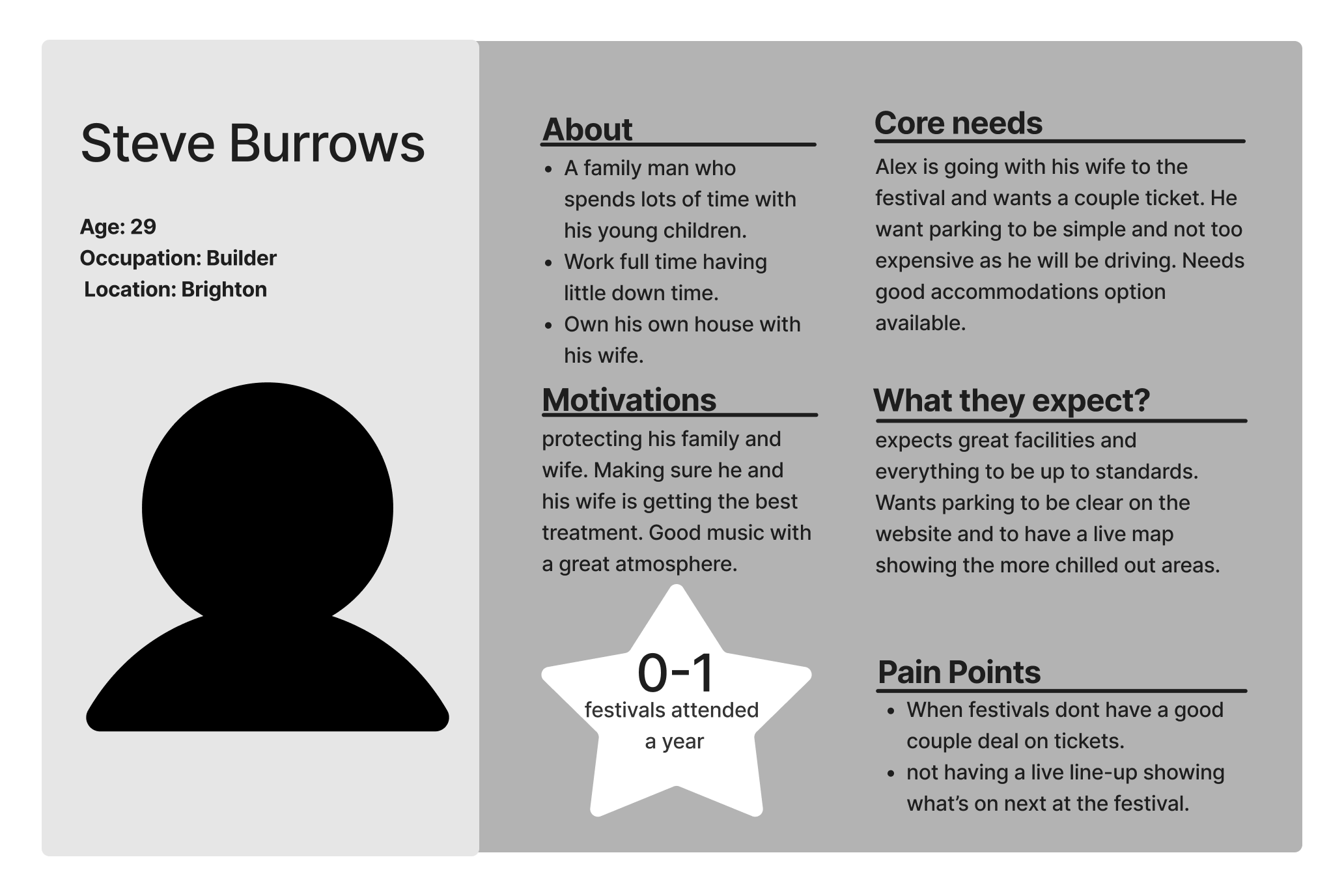
Below I have the Personas I have made for my Rock Festival, covering all ranges of the festival-goer. There’s also a link for my User Journey map as well.
User Storyboard
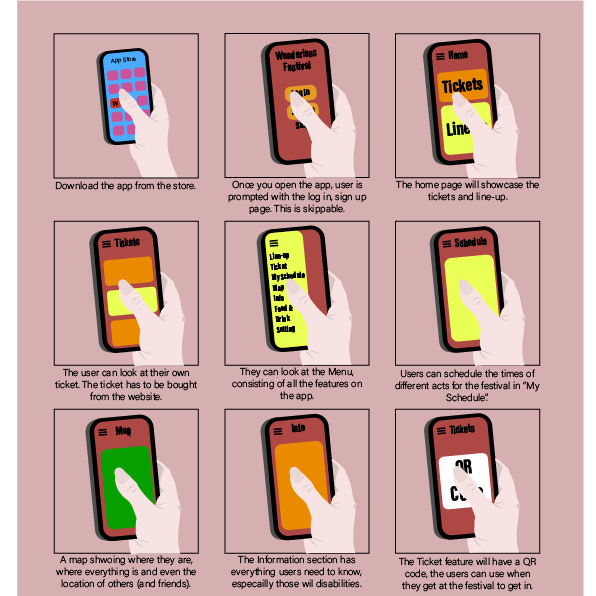
Below is a storyboard of how users would use the app.
The UI Principles
The app and website will have different design features. The website will provide users with information about the Festival and enable them to purchase tickets. On the other hand, the app will be more personalized and useful for users attending the Festival.
One crucial design principle I’ll use is Hick’s Law, which means that I’ll focus on the essential functions of a layout and minimize the number of steps required for users to access different aspects of the app/website. Great design involves giving users fewer options. I’ll ensure the aesthetics of the app and website will be painless instead of complex to secure ease of use for all users.
To ensure accessibility for all consumers, I’ll keep colour blindness in mind while designing. Using good contrast and clear font can help significantly with those who have colour blindness. The navigation of the app/website will be user-friendly, with the menu bar located across the top of the website and at the bottom of the app. These menu bars will showcase all the key content, along with an “extra” button indicating what else the app/website has to offer. I will be using icons for the page buttons to create a more user-friendly and playful style.
Another design attribute is to create space on the app/web. This means ensuring the information and buttons aren’t all squished together. Fabricating a cramped and complicated look as this is off-putting for the consumer. The user needs to be able to press each button on the app effortlessly. Not accidentally pressing something they didn’t want to.
The call to action design on the website will be for the tickets and line-up. I will generate buttons for these two options. To guarantee they stand out, they need to be big and bold. Including fonts, colour and shape, in contrast with the rest of the page. The position of these buttons will be at the top of the home page and/or in the middle of the page. The same design attributes will be the same in the app design. However, these buttons will be focused on the schedule, line-up and map. The design of both apps/websites will have a good flow as each page will have the same or similar layout and aesthetics.
Stakeholders who have an account with the festival app and website will gain more control of both media. There’ll be options for text-to-speech and to change the colours of the app for those who are colourblind.
Low Fidelity UI Prototype
First I will showcase my website’s low fidelity prototype. This is a very early stage and basic design that may change in the future.
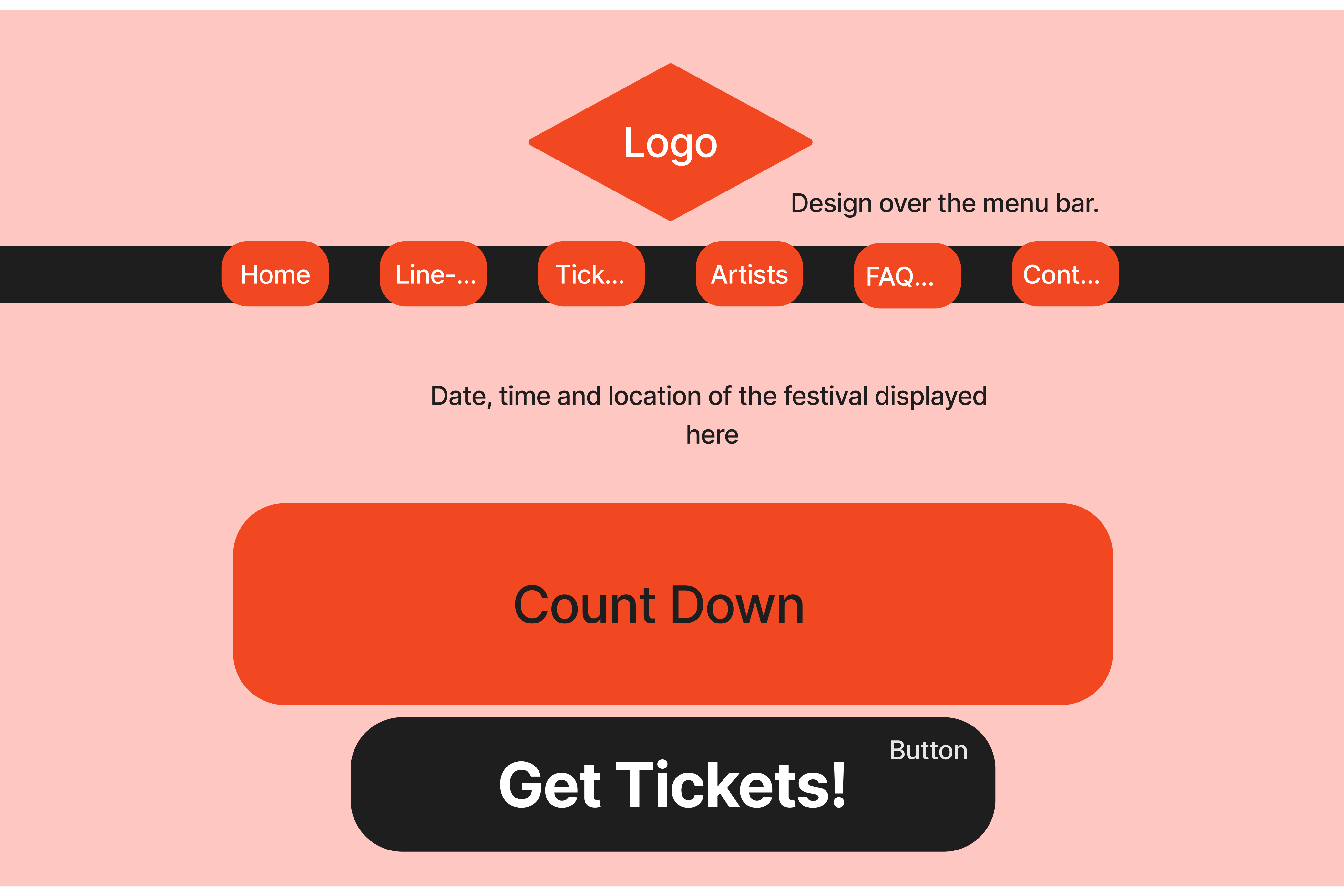
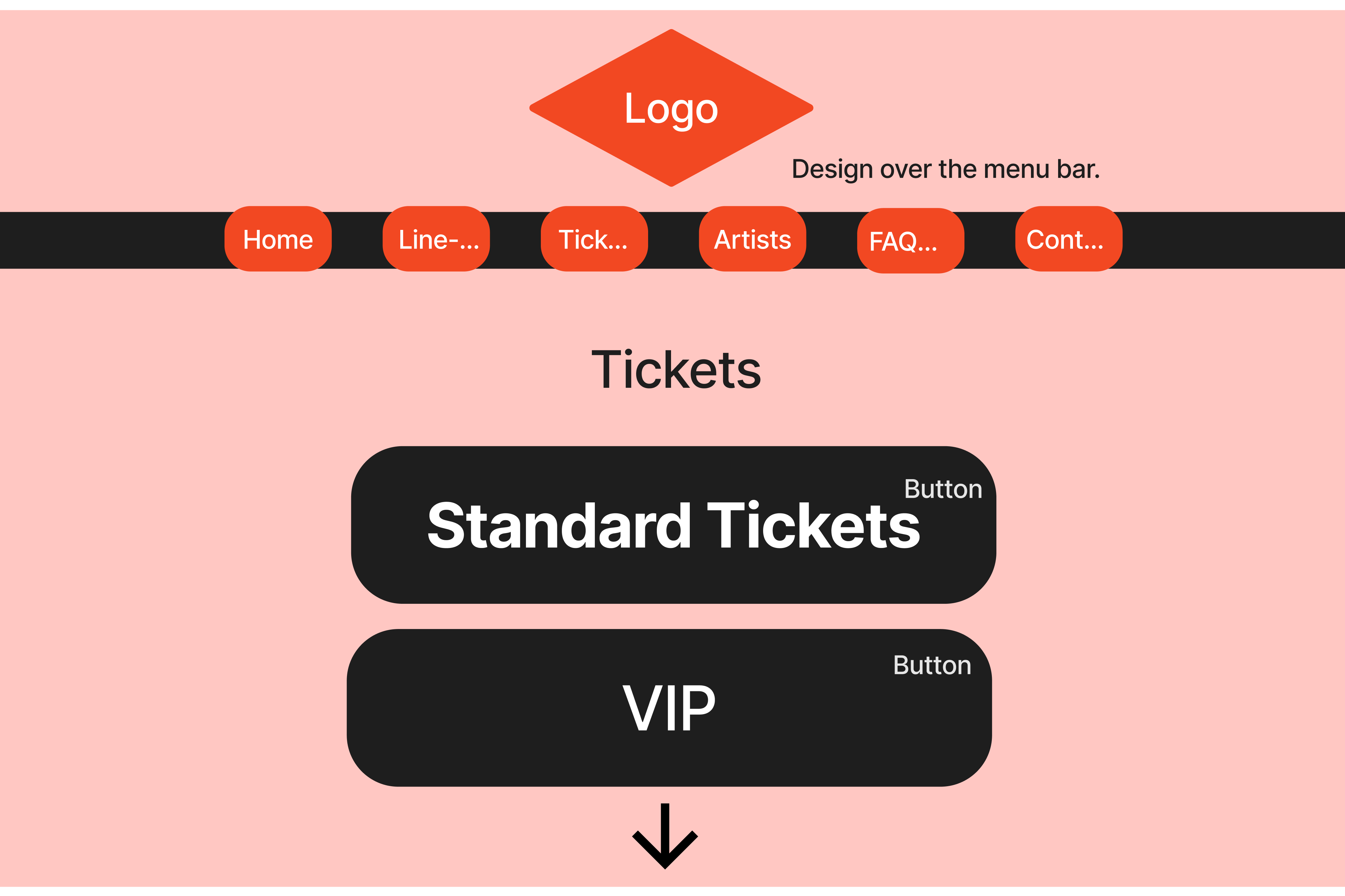
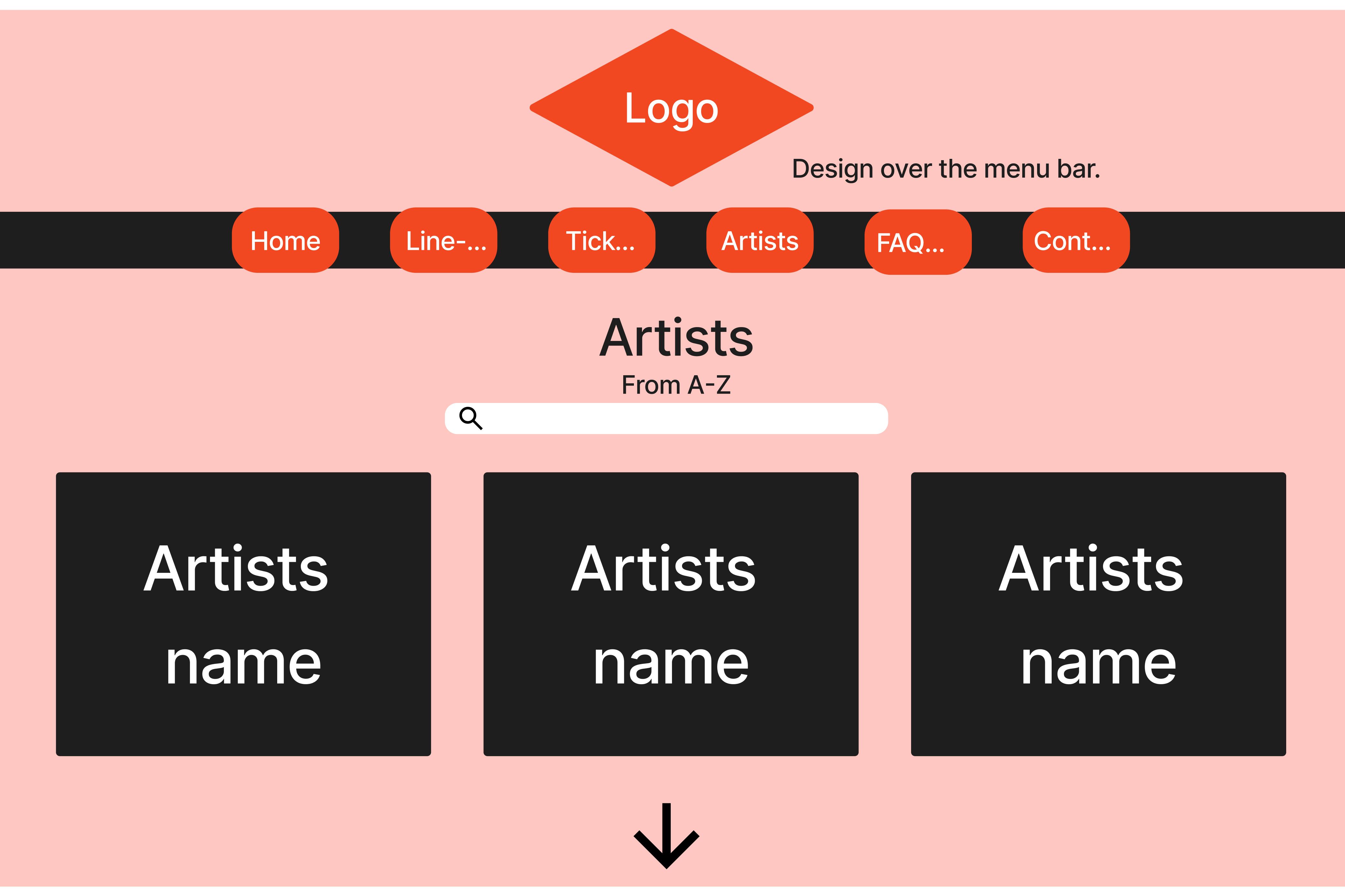
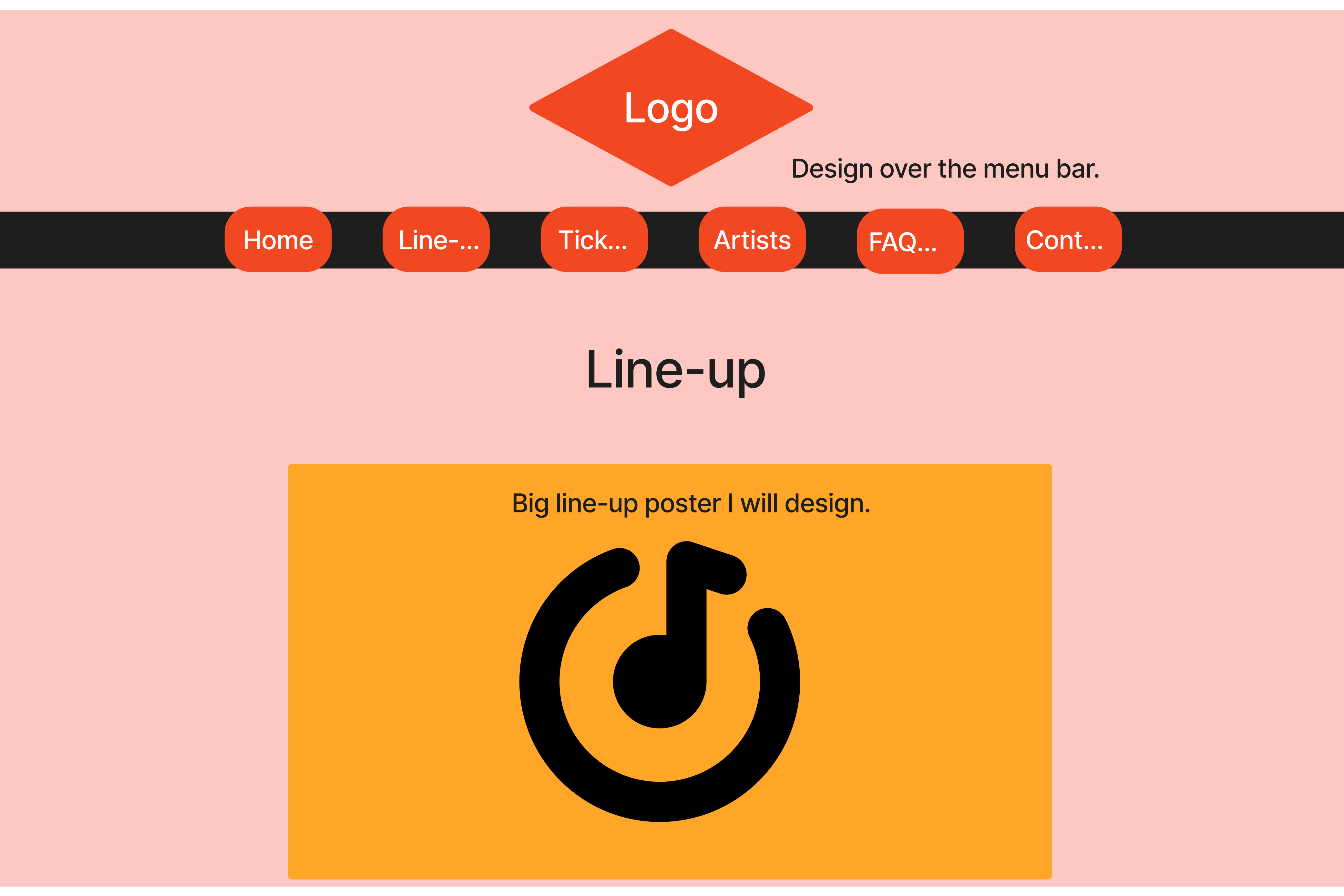
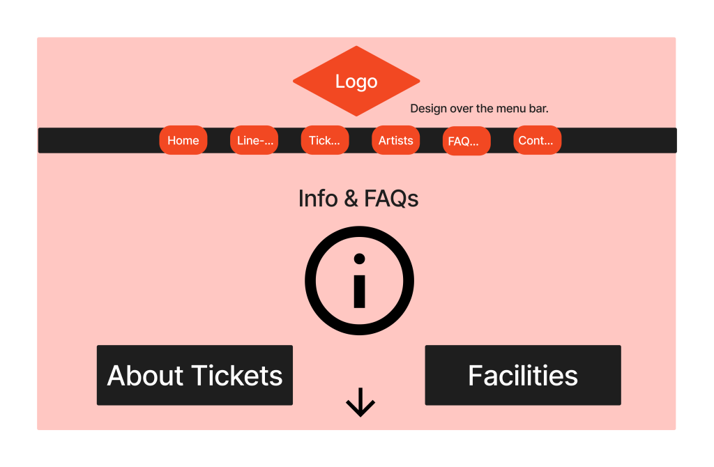
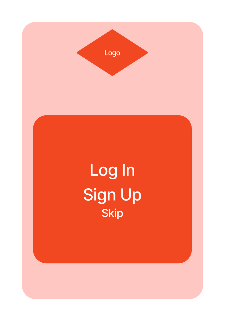
I have created five wireframes to organize the content that I will be showcasing on my Festival website. Instead of a sidebar, I have opted for a menu bar right across the top of the website. This makes it easier for users to see what the website has to offer right away. I have placed the most important page first and the least important page last. This way, consumers can find what they need easily. I have positioned the logo right in the middle of the top portion of the website with space on either side. I like this design as it brings the brand to life without overwhelming users with too much to look at. This creates a clear hierarchy in my design.
Next, I will Display my low-fidelity prototypes for my app design.
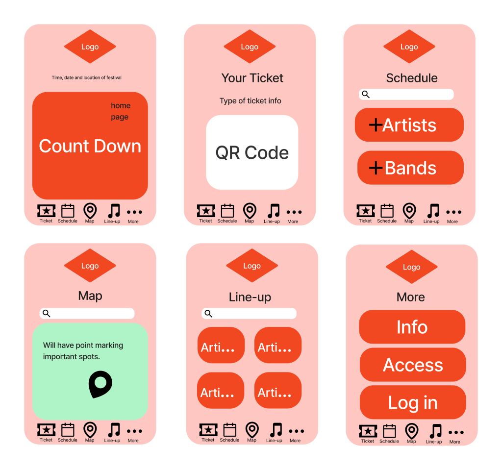
Here are my seven wireframes for my app. I went for a simple design with big buttons making it user-friendly. The logo again is at the top middle of the frame. I have placed a menu bar at the bottom of the design with icons, making navigation quick and simple.
Refrences
SlamDunk (Undated) Slam Dunk Festival. Available online: https://www.slamdunkfestival.com [05/03/2021].
HellFest (Undated) Hell Festival Available online: https://hellfest.fr/en/ [05/03/2021].
Download (Undated) Download Festival Available online: https://downloadfestival.co.uk [05/03/2021].
Glastonbury Festival (Undated) Glastonbury Festival Available online: https://www.glastonburyfestivals.co.uk [05/03/2021].
Mad Cool Festival (2023) Mad Cool Festival Available online: https://madcoolfestival.es [05/03/2021].
TripAdvisor (Undated) Download Rock Festival Available online: https://www.tripadvisor.co.uk/Attraction_Review-g499575-d8820197-Reviews-or10-Download_Rock_Festival-Castle_Donington_Leicestershire_England.html [05/03/2021].
Reddit (Undated) Well, what did you think? Available online: https://www.reddit.com/r/MadCoolFestival/comments/14ul8cn/well_what_did_you_think/ [05/03/2021].
Reddit (Undated) Slam Dunk in Review Available online: https://www.reddit.com/r/slamdunkfestival/comments/13uexb7/slamdunk_in_review/ [05/03/2021].
Festival Republic (2012) Download Festival Apple Phone Edition. Version 70.0.3. Apple Store. [6/3/2024].
Robert M (Undated) Understanding Music Festival Target Audiences [Blog post]. TSE Entertainment. Available online: https://tseentertainment.com/understanding-music-festival-target-audiences/#:~:text=The%20average%20age%20of%20attendees,largest%20segment%20of%20festival%20attendees. [06/03/2024].