In this post, I’ll be showing where I have implemented sustainable and ethical practices in the wireframes and brand guidelines.
Typography
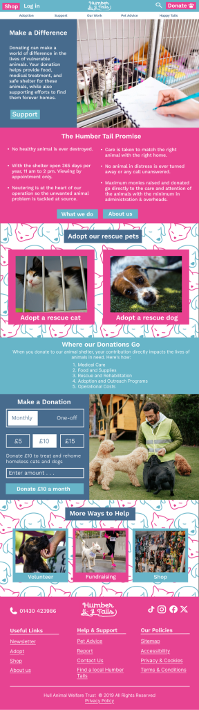
I aimed to choose a typography style that was ethical when it came to printing in the future of this charity. Fabricating a thinner logo and font means less ink will be used and that is why I wanted the make a simple logo design to make the charity more sustainable. I picked a font for the type on my website design and logo to be thinner than thicker. At first, I wanted a bold font to make the logo more eye-catching but decided that for sustainability reasons the font should be thinned out a lot more.
Colour
Using colour in a sustainable way for web design is to use low-energy colours, White uses the most energy for a website so I decided to include more colour than just keeping the background of the content white to avoid using too much energy on my site. Darker colours do use less energy but I wanted the branding to still be vibrant and easy on the eyes as accessibility is more of a priority to me, that’s why I used brighter colours including blue which is a high energy colour but is still less energy than white.