From the three briefs, I picked the Cab-E brief as I connected with the mood boards and style boards and wanted to further the branding.
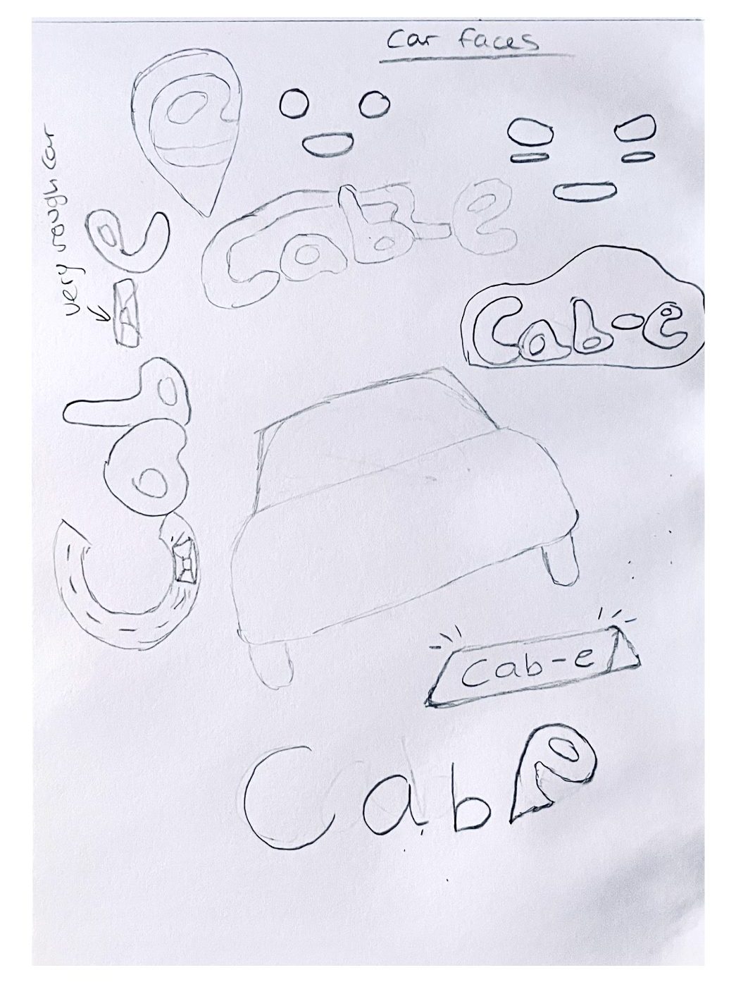
Early Logo sketches and Influences
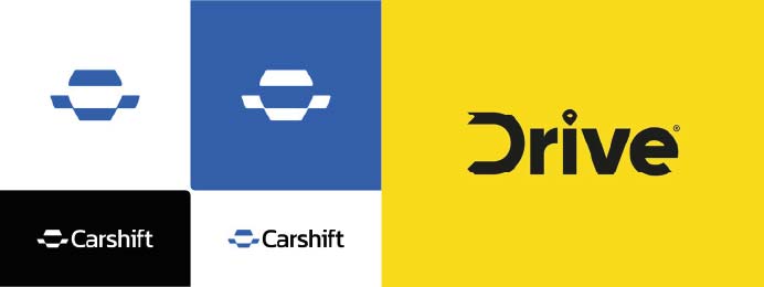
After researching other taxi companies, I realised most of them use their name in the logo with small design elements. The two logo ideas below are designed with a car and travelling integrated into the name which is my aim with this logo design.
The early sketches show all my ideas for the logo including the use of a car’s face like in the first influential piece above. I wanted the logo to be obvious it’s a taxi firm so I included different car designs and pin-point designs as well.
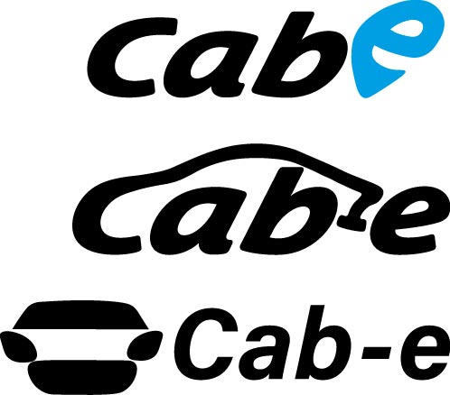
Three Logo Options
These are the final three logo options. The first is simple and uses the “E” from the name as a map marker, this makes for great use of the extra “E” and it flows well together with the italic font. The font used has that taxi feel. This logo would be easier to make into a smaller and simpler version using just the “E” as well.
The next logo expands off the first letter “C” to make the whole name into a car shape. The design is personal, creative and fun but doesn’t look as smooth as the first and would be much more difficult to simplify into a smaller logo design.
The final of the three logos uses the car face idea along with the name next to it as the main logo. The design element of the car face can be used on its own as the simplification of the logo.
All three express a taxi company in its style well with the use of a car design or something simpler but the final logo choice needs to be simplified into a smaller logo that still makes sense to the brand and the audience.
Final Logo Design
For the final logo, I chose the first out of the three options because it flows well together whilst communicating as a taxi logo. The “E” map marker would be great to use as a smaller logo design, whilst keeping within the branding of Cab-E.
The audience consists of families and everyday people so I wanted the logo to look fun and welcoming. The choice of purple being the primary colour expresses trust and calmness in the branding as the audience would want to most stress-free experience with the taxi company. The colours are different to other taxi companies making it stand out from the rest.
The secondary logo uses the map marker “E” in a softer and fun style, This is a simple logo that can be used on posters, products and on the website to communicate the brand identity across all platforms.
The logo overall is clear and simple whilst being unique and communicating the brand’s values of being a taxi company focused on giving people and families an easy and friendly taxi company to use.
References (Logo Influences)
Studio Beast (Dribble) (2018) Drive-Rideshare Taxi Service Logo*. https://dribbble.com/shots/4892736-Drive-Rideshare-Taxi-Service-Logo [10/12/2024].
Bohdan Harbaruk (Dribble) (2020) Carshift-Logo Design // SOLD*. https://dribbble.com/shots/10690306-Carshift-Logo-Design-For-SALE [10/12/2024].