For Early Design Prototyping, I’ll explore what the current competitors do with their branding and web design. My research will also include mood boards to express a better visual idea for each brief.
Eco Future
This brief involves green energy companies named EcoFuture. I analysed two different green energy businesses, each company varies in style, brand voice and overall goals.
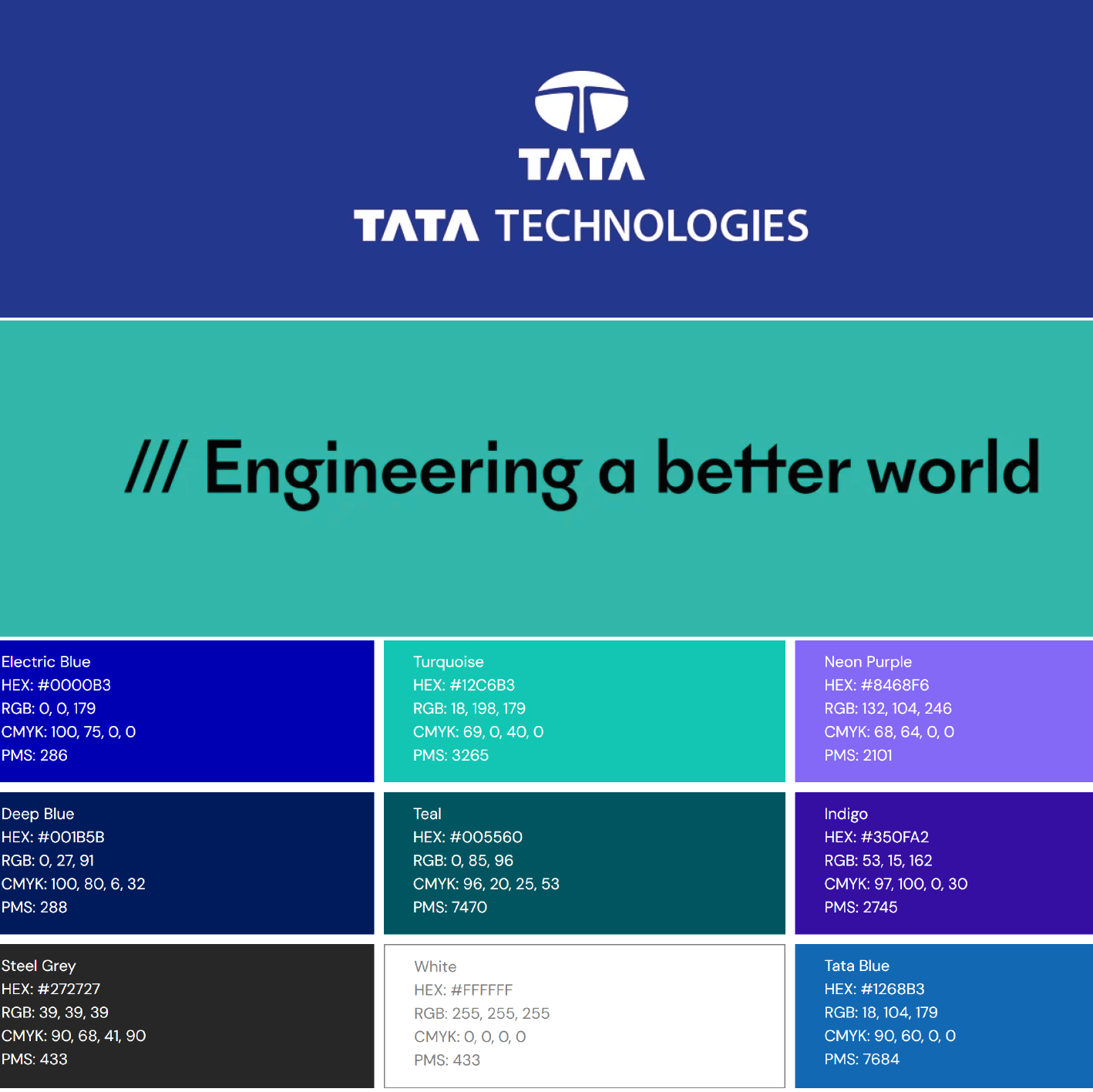
Tata Power
Tata Power is an integrated power company that transmits and distributes electricity in India and other countries.
Their branding voice is formal and business-focused, keeping their customers at the forefront. Their slogan is “Leadership with care.”
Tatapower’s branding is sustainable, emphasised by the use of the colours blue and green and phrases like “switch to smart.” Promoting a positive environmental responsibility. However, when viewing their overall branding, it isn’t obvious that their company is all about green energy due to the lack of design elements like imagery and shape. Making for a generic-looking brand. Including these elements would promote their brand values and identity.

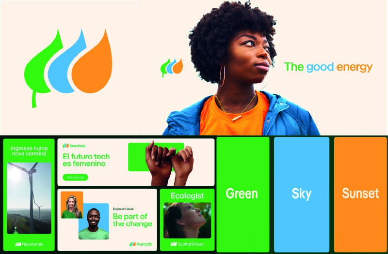
Iderdola
Iderdola is a global energy company that specialises in renewable energy.
Their branding voice is modern, friendly and sustainable. Their slogan is “committed to sustainability and innovation”.
The goal of their branding is to focus on using less energy resulting in a simple and authentic branding style. An example of this is Iderdola’s logo, using three shapes that represent a green leaf, a water droplet and an orange flame with no type making for a flexible logo. The logo successfully communicates the company’s goal of renewable energy which makes for great branding in a minimalist manner. The colour palette further emphasises an eco-friendly style with the colours, green, blue and orange, while the typography portrays a friendly and modern look.
Overall the branding is personalised and unique, making them stand out from the competition and become recognisable as a green energy company.
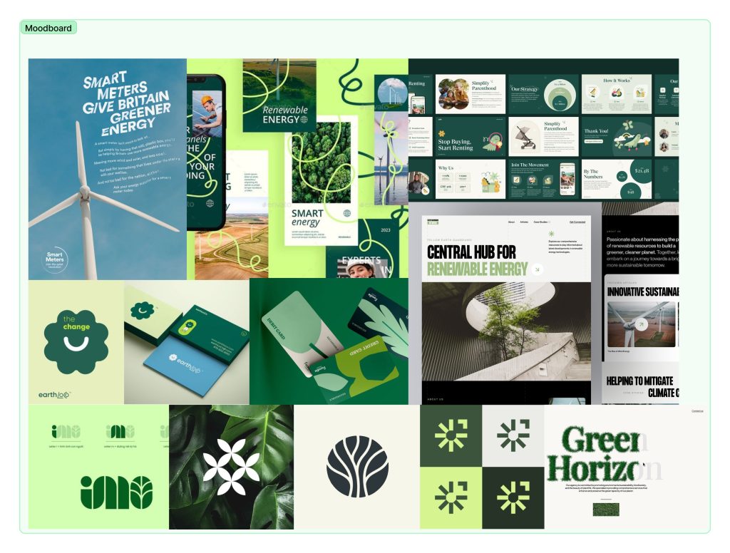
Moodboard
The first mood board created is more of a design flow of the style and colours that would work well in Eco Future’s branding. It showcases lots of different posters, along with online and physical designs. Expressing a fun and friendly feel.
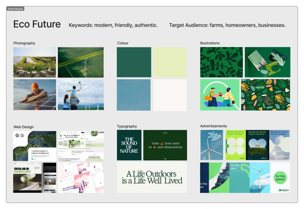
To refine the mood board and communicate the potential branding, I fabricated a style board. From this board, I express a vibrant and friendly branding voice with a focus on green energy with the use of green and blue. The colours are soft and light to convey friendliness and make the branding more inviting. The focus of the brand is creating a better future through the use of green energy. The audience is families, and other company’s.
Cab-E
This brief includes a taxi company that wants to expand to the online space. To get a better idea of the competition, I researched two taxi companies.
Lyft
Lyft is a cab company that offers rides, bikes, scooters, and rental cars in the United States and some Canadian cities.
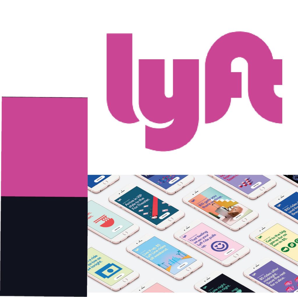
Lyft’s brand voice is casual and friendly, its three principles include; respect, elevate and to be humble. Their brand slogan is “Your friend with a car” reinforcing that friendly and humble feel.
The Lyft branding has a strong and distinctive style that resonates with the target audience. The brand values focus on approachability, modernity and fun, setting them apart from the competition.
Lyfts logo includes playful typography that is round and bubbly, making for that friendly and approachable feel. The use of their iconic bold pink is unique and helps the brand stand out as it’s not the usual colour palette you see being used in a taxi company. Pink showcases fun, creativity and energy aligning with the brand’s values.
The colour palette of the company is vibrant consisting of hot pink, white, black and purple. This promotes a playful style. This choice of colours brings positivity and innovation, creating a less corporate feel and more of a personal one.
Lyft values its customers and so makes sure their messaging portrays that. Their slogan “Your friend with a car” showcases this. Going along with the fun and more personal branding Lyft has fabricated, they made sure their marketing and advertising align with those values. Their marketing and advertising are vibrant and humourous, not taking themselves too seriously making the audience trust them more.
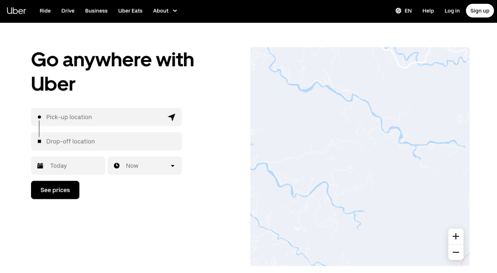
Uber
Uber is a ride-sharing company that allows users to request a ride from a driver using a smartphone app.
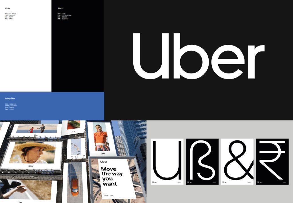
Uber’s branding voice is simple, bold and consistent. It’s very direct and straightforward, making for a professional and corporate style. Their slogan is “On our way”.
The Uber branding is sleek and professional, focusing on the minimalist style. The logo is simple, clean and modern, reflecting its professional and tech-savvy nature. The simple black and white creates a sophisticated feel to the branding. Their visual identity is consistent across their app, website and advertisements. The modern design promotes readability and functionality.
This branding style has earned the company global recognition. The short name and basic style make the brand more recognisable.
However, for this brief, we are looking for a more friendly and approachable feel to the branding. Uber is not this. Their style can come across as cold and corporate, with no focus on being personal at all. There is a lack of emotional connection with the users, especially compared to their competition Lyft. While the monochrome palette is sleek, it can feel uninspiring and bland. This makes the branding seem too serious, alienating a younger and more casual audience. The brand also has little focus on ethical and inclusivity issues.
Moodboard
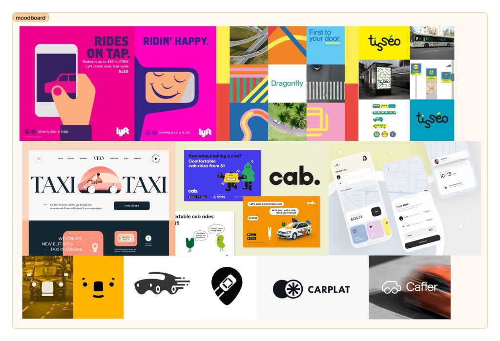
For the mood board for Cab-E, I focused on that friendly and warm feel to the overall style. Taking inspiration from Lyft’s branding, I combined lots of online and physical posters from Pinterest with a focus on taxi firms. The contents are colourful and fun. At the bottom, I have included some logo design ideas as well.
Style Board
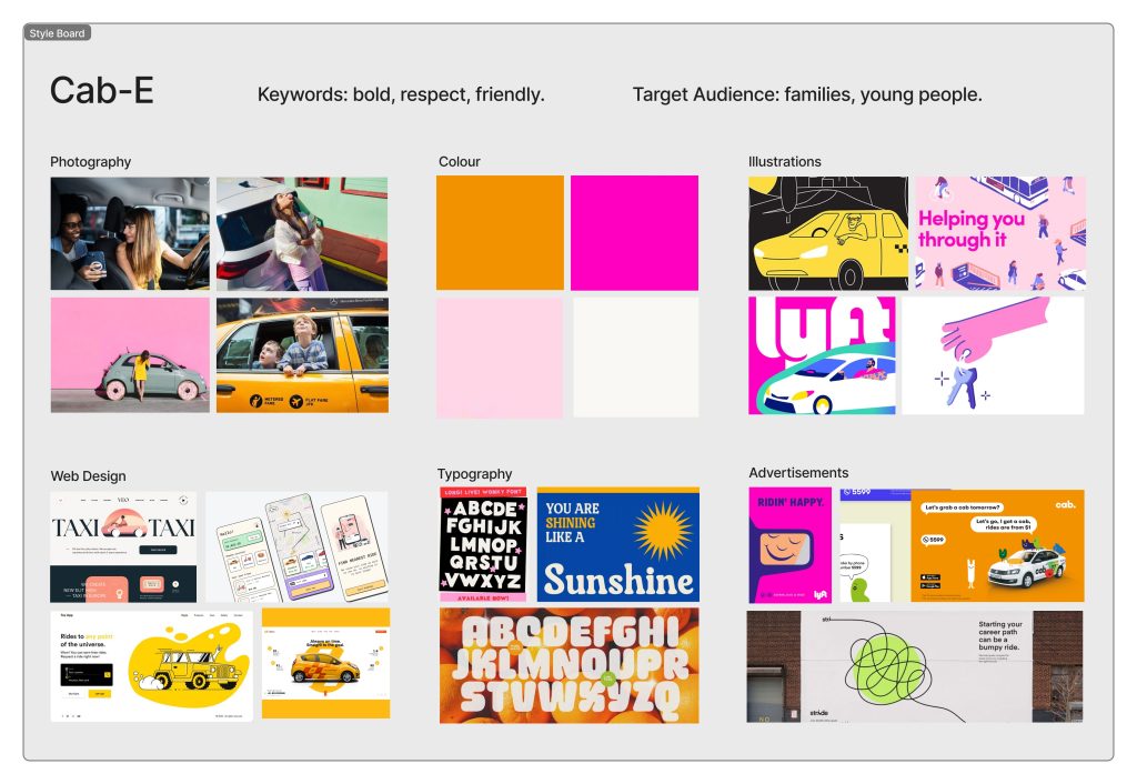
In this style board, I have refined that bold and fun branding style. The photography shows the audience and potential users of Cab-e, the demographic being focused on families and young people. For the colour palette, I went for a light and vibrant palette to emphasise that welcoming feel we want to achieve for the branding, however, these colours can change if I pick this brief. The included design elements and poster portray a playful and humourous feel to make for a more humble style.
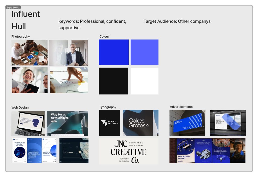
Influent Hull
In this design, we are tasked with developing a branding style for a business consultancy group. For this, I have researched two different consultancy companies to see what their branding and values are.
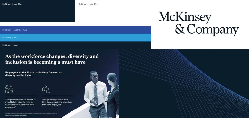
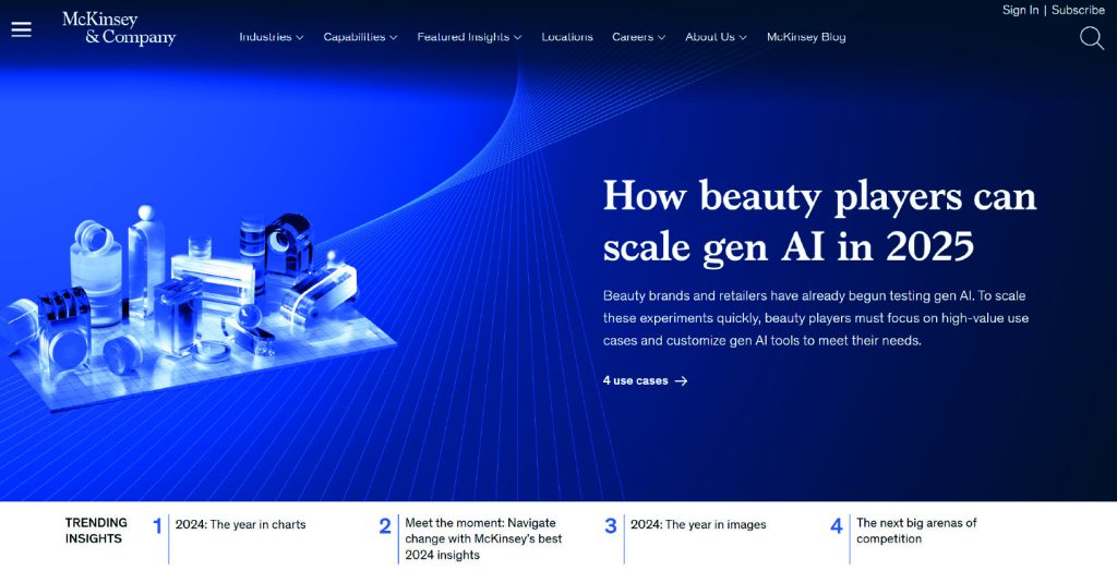
Mckinsey & Company
Mckinsey & Co’s brand voice is serious, and quiet and focuses on their practicality, not emotion. Their brand’s slogan is “Different worlds, one Mckinsey”.
The brand’s logo uses a clean, serif typeface that conveys a sense of tradition, authority and professionalism. The use of the typeface promotes intellect, which resonates with its branding. The word work logo is styled in black or dark blue, creating a minimalist look to avoid distraction. The colour palette consists of navy blue, black, white and a lighter blue. These colours convey trust and authority. The palette is more serious and less flashy. The imagery and visuals used are simple, with clean layouts, subtle design elements and professional photography. This shows their focus on practicality and not emotion, as they avoid dramatic visuals. This can cause issues not connecting to your audience on an emotional level but it is the brand’s values.
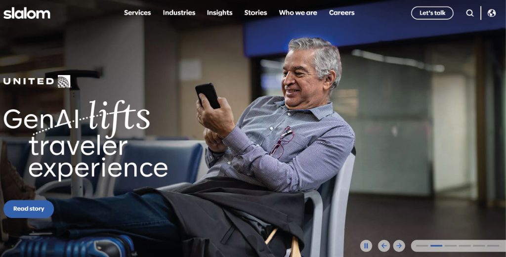
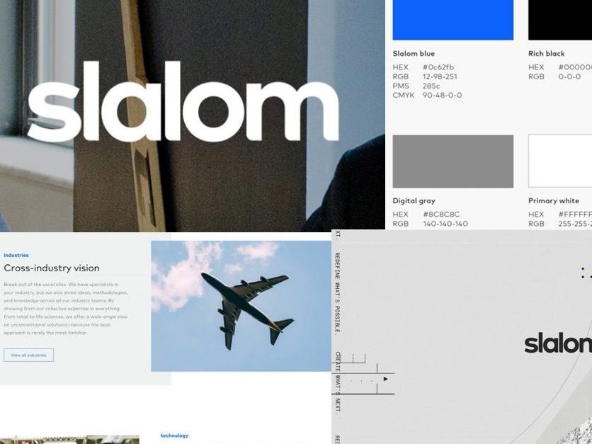
Slalom
Slalom’s branding voice is authentic, inclusive, customer-focused, and emphasises impact. Their brand slogan is “What matters to you, matters to use.”
The brand’s logo is minimalist with lowercase lettering in a clean, sans-serif typeface, reflecting simplicity, modernity and approachability. The logo is sometimes portrayed in blue, which symbolises trust, readability and stability. The colour palette is vibrant yet professional, including shades of blue and grey. These colours and how they are implemented make Slalom stand out from the competition. Slaloms Imagery showcases people-focuses imagery to highlight collaboration and human-centered solutions.
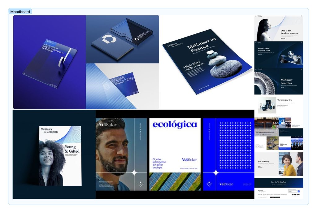
Moodboard
This mood board takes heavy inspiration from the two brands I looked at above. I focused on a corporate style with the use of blue and an elegant feel.
Style board
For the style board, I showcase the corporate look for the potential branding, with people-focused imagery and little design elements as I wanted to focus on professionalism.
Link to Figjam board
https://www.figma.com/board/CKEgIirMpV36tUOx5ByQ79/Web-Tech?node-id=0-1&t=8g8McwrRWQsHvXWf-1