My group decided to focus on different elements of improving Edecks’ overall brand. We discussed who wanted to design what, and I chose social media advertisements. For this progression, I mainly got advice from James on improving a poster to be easier on the eye and to make call-to-actions better.

For this poster, I was advised to darken the background imagery so the boxes and text would stand out more clearly. This helped create a stronger contrast, making the overall design feel more focused and readable. I also moved the text from the center over to the right side — partly to give it a fresher look, but also to help it line up better with the rest of the layout. It gave the whole poster a bit more balance and made the structure feel more intentional. On top of that, I was told to make sure the text aligned properly with the top and bottom elements, so I adjusted the spacing to keep everythingneat and well-positioned.
I later redesigned this poster with the rebranding I did. I kept the image but changed the colour and font and included the logo. This will be featured in my final portfolio video.
The Rebrand
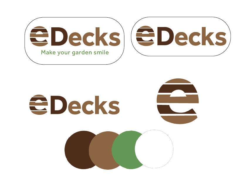
For the rebrand, I introduced a color palette featuring warm browns, clean whites, and a bold accent green. These colors work together harmoniously to create a grounded, earthy feel that evokes the outdoors and hints at natural materials like wood and foliage. To strengthen the brand’s overall identity, I updated the logo’s font to something edgier and more structured. This gave it a sharper, more professional appearance while still feeling accessible. A key part of the redesign was making the lowercase “e” the central design element. I crafted it using the visual language of decking boards, which ties in directly with the brand’s outdoor and construction-related themes. The “e” on its own is quite distinctive and minimal, so incorporating that decking motif helped give it more context and made its role in the logo clearer and more meaningful to the audience.