In this blog post, I’ll explore how I incorporate Edward Tufte’s five theories into my animation and showcase the progression and design thinking.
Use of Colour
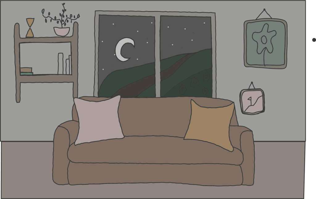
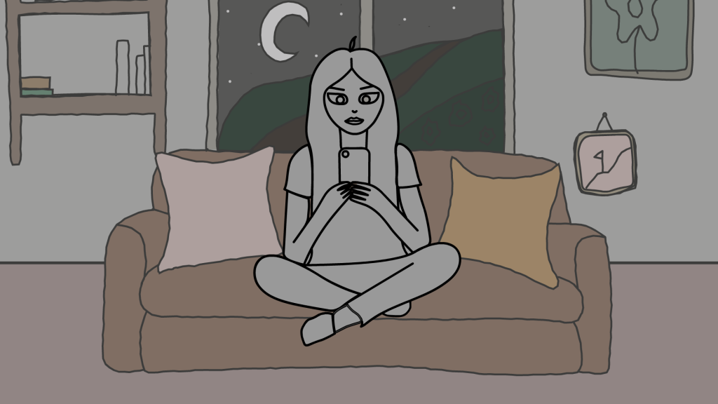
The colouring of my overall animation will include natural, everyday colours that the audience can relate to in their own lives. Using everyday colours will build a better connection with the viewers, communicating the story and emotions. The shading is unsaturated and darker in the backgrounds of each scene to emphasise the subject matter (the character and phone). The subject will be a lot lighter and more vibrant in colour. The overall atmosphere at the beginning of the animation is dark and sombre as the character delves into the addiction to social media and its consequences on their mental health. Tufte clarifies that colour should only be used when necessary and not removed from the subject. Using colour in my animation is vital to bring the scenes to life and create emotions that the audience will understand. Near the end of the animation, the colours will lighten up to fabricate a softer and joyous atmosphere as the character moves on from social media.
Micro/Macro
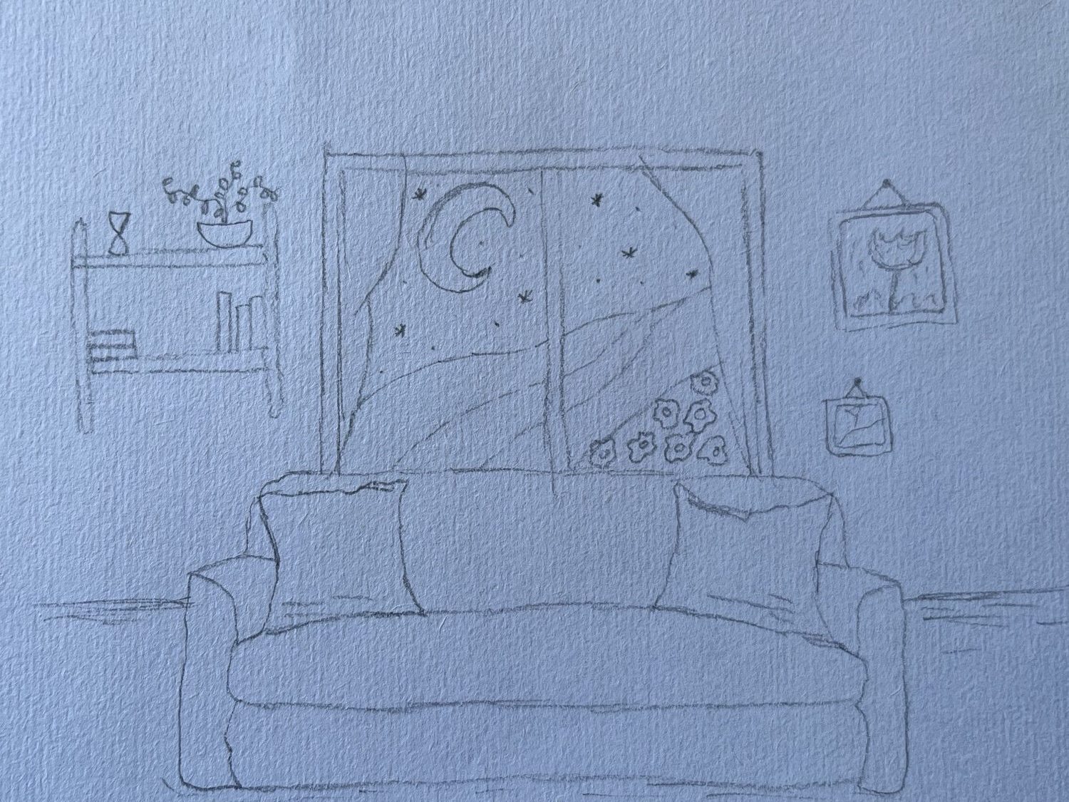
The character I designed is simple, with no extra details but just enough to show expression and make the character relatable to the audience. I chose to draw a young woman whose age ranges from 16 to 20, as that is the bigger demographic for people who deal with social media addiction. The backgrounds have more details, such as things hanging on the wall and the window showcasing the outside world. Details are needed for good world-building to invent an immersive and interactive story. The panels also relate to the micro/macro theory; I included some shorter scenes to emphasise the character’s mindset as she goes through the addiction and then eventually leaves it behind. For example, in the scene with a close-up of the character’s face, scrolling on their phone, the screen reflects into her eyes, showing her mind becoming invaded by the content she’s viewing.
Small Multiples
The composition of my animation places the character in the centre of the frame; they won’t move until the end of the animation. Cutting back to the character sitting in this scene is an easy pattern to fabricate. This centre composition will be used for phone scenes that showcase the subjects using social media. The centre composition is simple and won’t overcomplicate the animation or confuse the audience by not constantly changing the location and scene design.
Narrative of Space and Time
I displayed the location by designing a detailed background with everyday objects everyone recognises, making it evident that the animation begins in the character’s house. I included the window in this background design to show time passing. It starts with a nighttime scene outside and ends with a morning scene in the window. This emphasises how addicted the characters are, as they spend all night on their phones, expressing the passing of time.
Layering/Separation
The layering is simple in my animation. The background and the subject are in the foreground. I’ve designed this using colour. This relation changes at the end of the animation as the character leaves the scene and becomes the background as we see the character walk away outside the window. In the scene of the close-up phone, I plan to add the thought in text around the phone so the audience knows what’s going through the subject’s mind. I will layer the text on top of this scene. I will handwrite the text with a drawing pad to make the text look more like a passing thought that comes suddenly.