For this post, I’ll be showcasing the progress of the rebrand and website designs.
Logo Design
For the logo, I abbreviated the Hull Animal Welfare Trust name to “HAWT” to make the design easier to digest and recognise. Having a long name within the logo creates a messy look and is difficult to read.
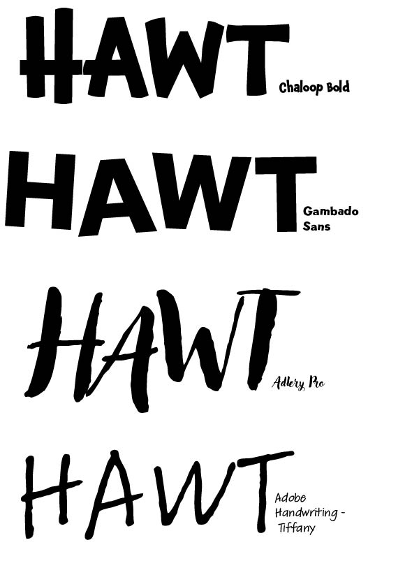
With the goal of making the branding more unique and joyful, I wanted to use a soft and sketchy styled font. I decided to go with the chaloop bold font because it’s easy to read, bold making it more eye-catching, while being a fun font.

Using the same font above I fabricated some logo designs. It was quite tricky designing with a long name that included letters that don’t relate but I tried different layouts to see what worked. The name logo that worked best is the top one along with the heart shaped dog below. Involving the cat and dog illustration within the text means there’s no added size to the logo while showing the charity’s cause, that being a cat and dog shelter. Having a simple logo design that can stand alone without the name was something I wanted to create as it would help the charity become more recognisable. The heart logo design would be easy to use on any type of marketing or products as well.
However, I wasn’t happy with these logo designs so I decided to change the name of the charity to Humber Tails making my ideas for design flow much better.
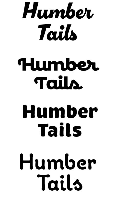
Keeping in theme with a light-hearted and cheerful feel, I chose these fonts and after feedback and what worked best with the name I went with the second font called “Confiteria Script”. The joint up letter gives the name a calm presence.
I explored with the fonts heaviness and different design iterations of a cat and dog shelter. My aims was to include both animals within the logo but that would then create a bigger and clunkier logo which would be hard to use on a website or social media. The logo I got the best feedback on was of the sleeping dog below the text. This logo is styled in that sketchy way that I aimed for and using the charity’s name as the dogs body. This logo is also the smallest one using the full charity name. At first I liked the idea of the tail to the right of the design but decided to simplify it to make it easier to digest. I also explored on an abbreviated version of the name logo using just the “HT” using the same dog but cropped.
For the final logo, I adjusted the main one to have a bolded font with the line work of the dog including a similar thickness to make it flow together better. For the smaller logo version, I picked the one with the dog’s head in front of the HT as it was simple but effective. The viewer can still see the name being HT with the dog’s head overlapping making the logo take up less room. I chose this one because it had the post symmetry and used fewer lines than the others making it much more simple.
I finalized the main colours for the logo and overall branding here as well. I went with two bright colours blue and pink. Blue with a heavy colour used in the original branding and website for the charity so I wanted to incorporate that with a new bright colour. The pink goes well with the bright blue and because the charity is only a cat and dog one, it shows the duality of the charity. I then added a much darker blue to add contrast so the designs aren’t too bright for those who are colour-blind.
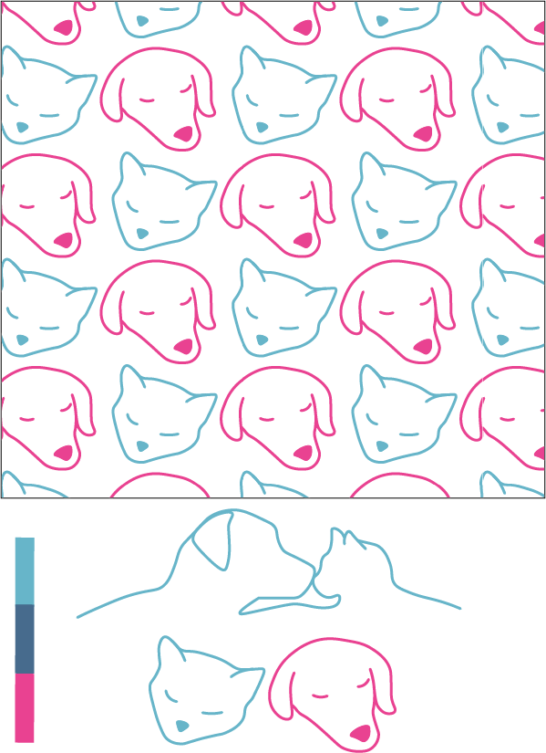
Taking a lot of design from the logo, I made two main design elements including a cat and a dog to represent the charity. I added the face of a sleeping cat next to the sleeping dog for a more light-hearted style. I decided to create a pattern using this which can be used in the website design and any future campaigns or social media designs. The idea for the Silhouette of the cat and dog was to be placed at the bottom of the website as I noticed a lot of charities have a design element near the bottom of their page, so I fabricated something with symmetry in the same style of the other line drawings to put at the bottom of websites pages.
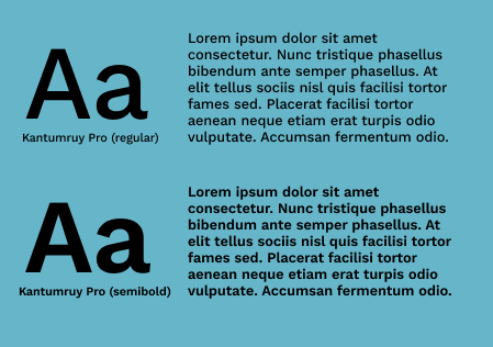
I chose this font within Figma as that’s where I did my wireframes and website designs. I was searching for a softer-looking font that was still practical and easy to read in paragraphs, I found Kantumruy Pro on Figma which is still a more fun font but is easy to read and makes sense for the overall brand guidelines. I was thinking of using a more out-there font but it wouldn’t have been practical for the accessibility standards I’ve set for this project goal. I have chosen to use this font in regular and semi-bold. Regular will be for any paragraph writing and semi-bold id for headings that need that extra attention and differentiation.
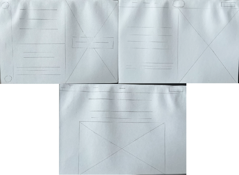
I sketched out three layouts for the wireframes on the desktop and went with the bottom one as that made the most sense since I just wanted to create a coherent website that flows well.
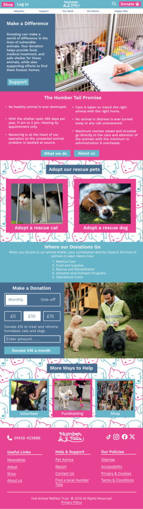
For my mid-fidelity, I changed the layout again as I found this way I can include images and content together. One feature a lot of animal charities have when you first click on their page is content that garners sympathy from the viewer by using an image showing an animal in distress or in an unhappy way while giving you a choice to help animals by donating or adopting. This is a smart move as it pulls on the heart strings of potential donors the second they see the website.
For the content of the home page, I took inspiration from other animal shelters and what they involve. I thought it was important first as well for the audience to see what the charity’s mission and goals are. Being as transparent and trusting as possible I included about where the donation money goes on the home page. I added lots of call-to-action buttons within the content and at the very top and bottom of the page, this was something the original charity website was lacking so I emphasised it.
I integrated some content from the original website as well like their mission statement and their adoption section. I wanted the bottom of the page to be packed with helpful links and their social media. Including all the most important features of the charity within one page.
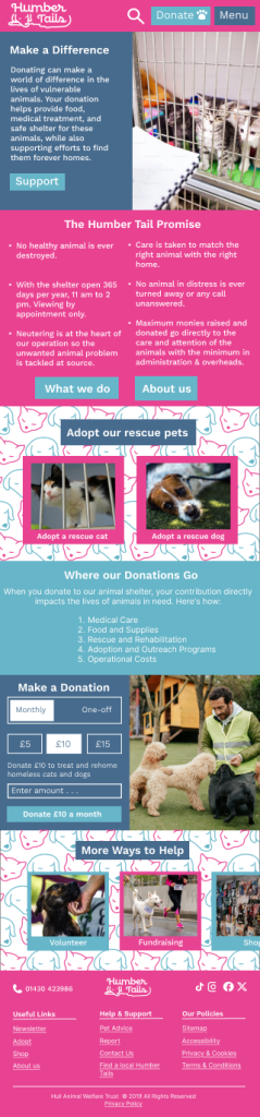
For the high-fidelity, I had trouble being able to upload it onto this WordPress site so had do compress it causing it to go blurry, I apologise for that.
In this version of the website, you can see I’ve changed the layout slightly after receiving feedback from my colleagues. The logo placement has moved to be in the centre of the top and bottom bar, this is because of the style and how long the logo is, it garners more attention being in the middle than tucked away into the corner, it needs that open space on either side of it.
I added context to each section including the sympathetic post at the very top to collect that sympathy early on from the audience.
I made the content fit the width of the screen inside of being in boxes as that creates more open space and emphasises the content that is already there.
To make the site responsive, I created a version for the phone as well because people use their phones a lot more than their desktops for websites. Here I changed the content slightly to fit the smaller screen, making sure viewers can easily see it. The top bar is simplified also with a menu button that would drop down to view all the other pages within the website. The other thing I changed was the 2more ways to help” section, making that a scroll across for extra content so I didn’t have to squeeze it all into a small area.