In this post, I’ll be showcasing all the wireframes I worked on and my design thinking behind all of them.
Low-fidelity
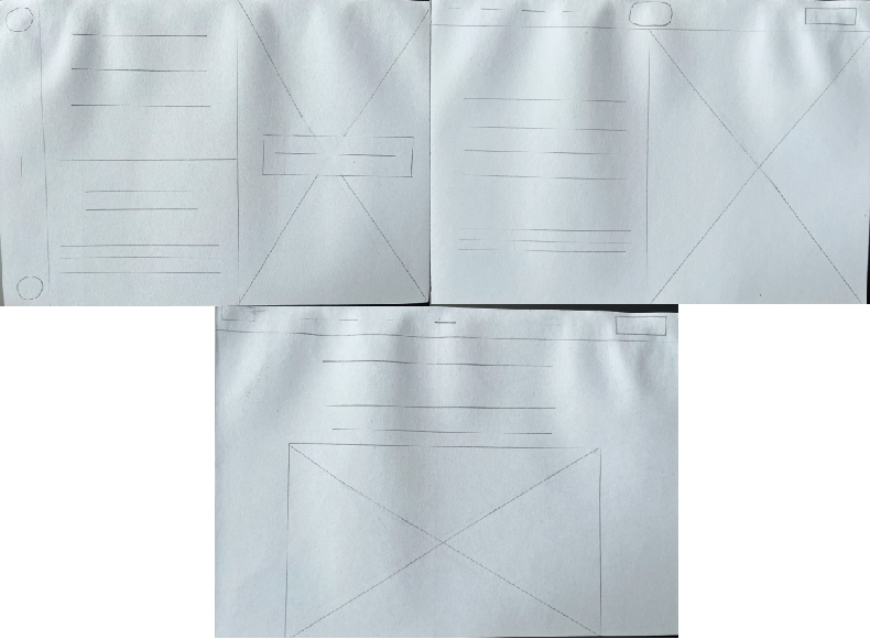
For these low-fidelity wireframes, I designed three different layouts to choose from. The first one is heavily inspired by the Wild at Heart charity website as I liked how unique the layout was but thought it may be impractical for my accessibility goals. The first and second layouts are more generic and simple in design, including the menu bar being at the top and the content below, I enjoyed the design of the split screen look in the second one but when it came to designing my mid-fidelity, I found the last wireframe made the most sense for the website as it easily guided the user through the site.
Mid-Fidelity
This wireframe is where the layout of the website and organised content started to come together. I listed off the most important features within the homepage of this wireframe including call-to-action buttons, imagery, and a donating and adopting option. Keeping the content evenly space to allow that empty space to emphasise the content.
High-Fidelity
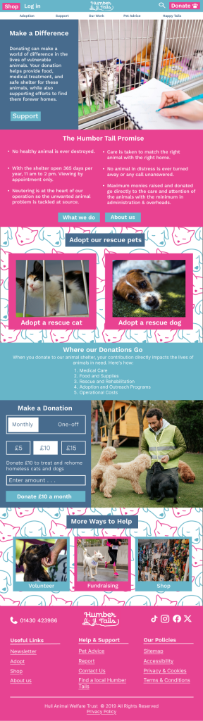
This is the final layout of the website I had in mind. It includes the important content I wanted, lots of call-to-action buttons and a much brighter and more vibrant colour palette. I included all the vital links at the bottom of the page with the accessibility options as well, as their phone number and social media. I involved my design elements in this final version with the pattern used in the background of some content bringing a more fun and vivid feel to the style of the site.
All images used in the high-fidelity wireframe are from the fair-use plugin on Figma called UnSplash.