For the wireframe prototyping, I’ll design a taxi app for Cab-E using the primary colours and a user-friendly style.
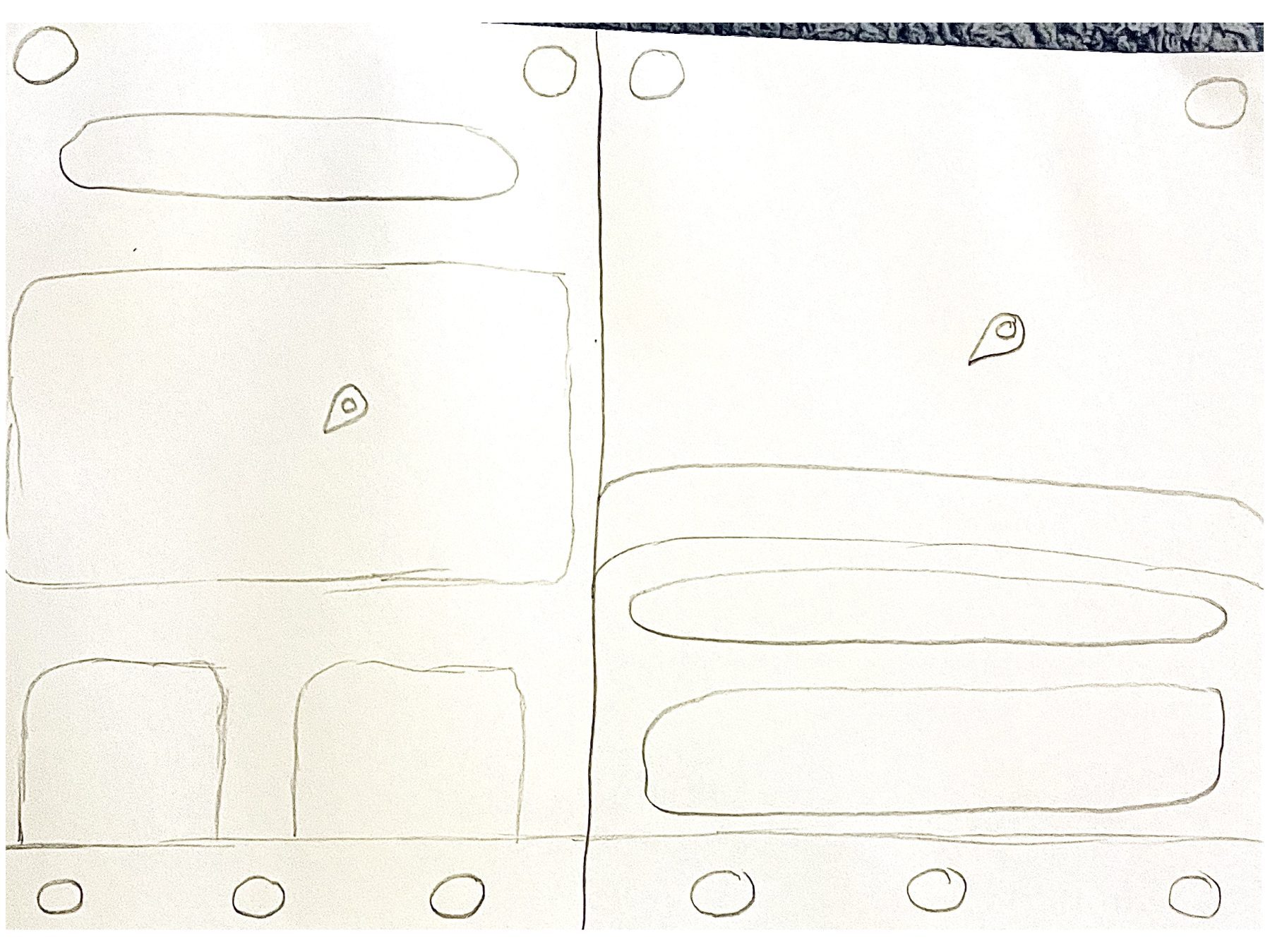
Early Sketches
These rough drawings show two layout styles for the home page. Both use curved rectangles for that friendly feel with minimalist tabs at the bottom and top as their main feature is to get the audience a taxi fast and simply.
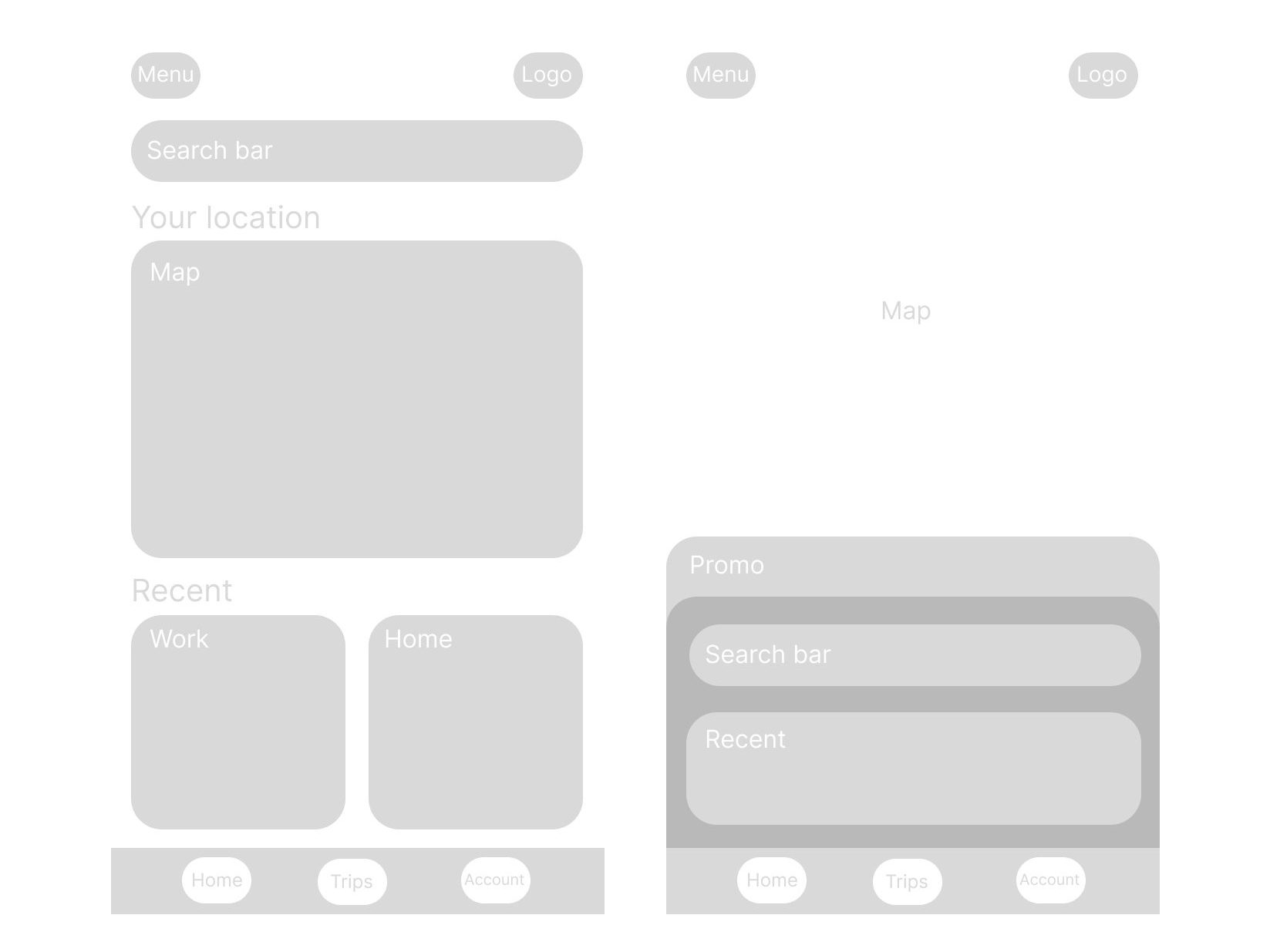
Two Wireframe options
Below are the two rough mid-fidelity wireframes showing the softness and friendly look of the designs. Each includes important information like the map, and recent places the user has travelled to to make it even faster for them to get to where they wanna go. There’s a search bar at the top to look for other locations and tabs at the bottom which will include the account and past trips. At the top will be a menu bar for extra settings and help for the use along with the logo. The section design has a focus on travel than other options like the first design has.
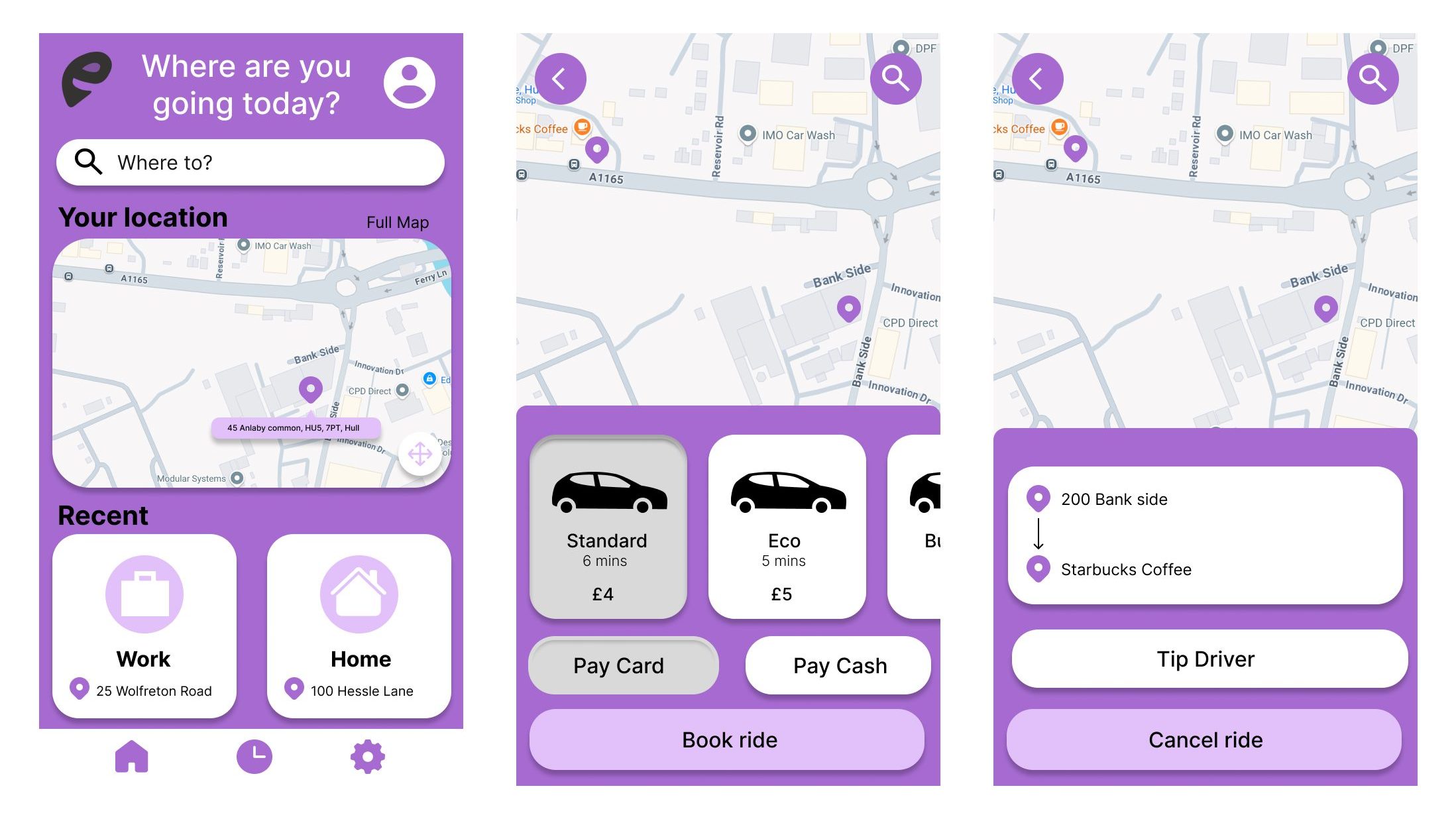
Final Wireframes
For the final design, I decided to go with the first design in the mid-fidelity options. This is because it gives a more friendly introduction to the app where they can explore easily what the app has to offer. I changed where the account button is to the top right so it’s much easier for users to find while adding settings to the bottom menu, again so users can find what they need faster. I didn’t want to include too many tabs at the bottom because I wanted the app to be streamlined to just a taxi booking system that’s personalised to the user. The user can use the settings to change the colours of the app if they have visual or colour blindness issues to make the app as accessible and personal as possible
I used the primary colour as the background colour for this app to keep within the branding and make it much more recognisable and different from other taxi booking apps. I added the logo at the top left as that’s what users will see first and recognise it as the Cab-E brand.
The design is consistent across all app pages with the colours and shapes used making for a professional look. I included the booking system pages as they are what will be used the most so it’s important the design is user-friendly and consistent. All the information like locations, prices and driver options is clear and straight to the point to make for an easy and calm experience for the users of the app.
References (Google Maps)
Google Maps (Undated) Ferry Ln*. https://www.google.co.uk/maps/place/Ferry+Ln,+Hull/@53.7669135,-0.3336386,18z/data=!4m6!3m5!1s0x4878be6844a84f97:0xbe65ae24250360a7!8m2!3d53.767294!4d-0.3292988!16s%2Fg%2F1tfvynp1?entry=ttu&g_ep=EgoyMDI1MDEwMS4wIKXMDSoASAFQAw%3D%3D.[05/01/2025].