To develop the user experience of my festival website, I have gathered UX information online and looked further into each webpage of my competitors. Additionally, I surveyed 00 participants to gather valuable insights and feedback from actual users. This approach was extremely helpful in improving various aspects of the website design, as it provided me with real-world experiences and perspectives.
Firstly, I looked into my competitor’s websites. I did this to get insight into what to include in my festival website and what I can improve. One major factor that makes up the website is the menu bar. Originally, I wanted to fabricate a top bar menu, as I liked the look of that bar better. However, after researching online, I discovered the side menu style is much more user-friendly. The side menu is seen first by the user as they read left to right, can accommodate much more content and is easier to understand when scaled-down than a top bar. Overall, making the site streamlined by giving the best user experience.
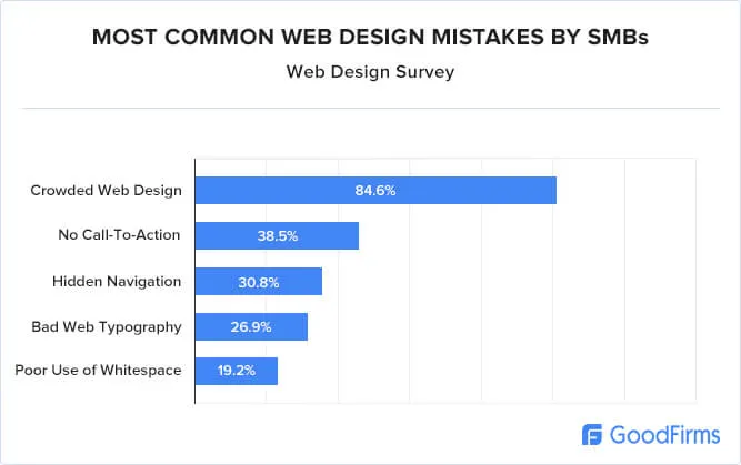
The number one reason for people to leave a website is overcrowding. Having too much information at once, too many illustrations and imagery that don’t correspond, can all factor into this problem. After finding out this information, I’ve made it a priority to give a lot of space between information delivered and to focus on one call-to-action button on my website.
Finally, I conducted a “User experience for a website” survey, I shared this survey with classmates, friends, family and my target audience online. Doing this helped define my design decisions for my final website design while keeping the user in mind. I got 20 responses for this survey altogether.
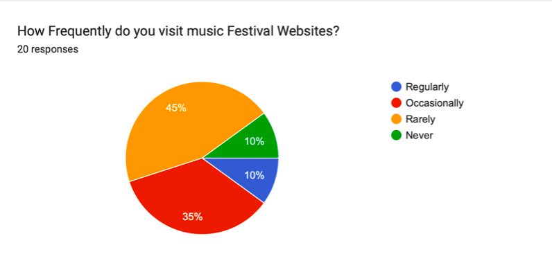
For the first question on my survey, I asked how often the participant uses festival websites. 80 % of users occasionally or rarely use a festival website. Only 10% have never used one. This is vital data to gather, as it lets me know if the user will need help to guide them through the website and why users don’t use them more often.
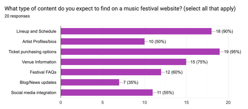
The fourth question gave me a great understanding of what is most important for consumers on a festival website. I asked, “What content would you expect to find on a festival website?”. Ticketing options got 95% of the vote, and lineup/schedule got 90%. That’s a massive portion of the votes for this question, and I will include these on the website. Social media integration, artist profile/bios and festival information/FAQs got about 50%. While including a blog/news got the lowest with 35%. For the festival website, I will add all these pages, this information lets me know what the users want to find first.
For the Sixth question, I asked the percipients what device they use for looking at a website, phone or computer. Coming back with a pretty even split reinforces how crucial it is to have a well-designed responsive layout.

Lastly, for the final question, I asked if they valued interactive features on a festival website. 73.7% of participants said yes. This informs me to include photos and videos.

Overall, all this combined research has guided the design of my website in the correct direction for the best user experience. I have changed and refined a lot of elements of my website now.
Figjam Design Board
Refrences
Serhat Erdem (2021) 50+ UX (User Experience) Statistics and Trends. Available online: https://userguiding.com/blog/ux-statistics-trends/ [1/4/24]
Taras Bakusevych (2021) Top vs side navigation: Which one is better for your product?. Available online: https://uxdesign.cc/top-navigation-vs-side-navigation-wich-one-is-better-24aa5d835643 [1/4/24]