For this post, I will be displaying the mid-fidelity layout for my festival website. Also including responsive layouts for smaller screens.
Mid Fedilty Layout
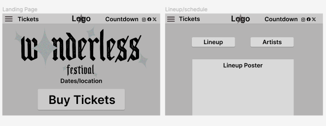
For the landing page of my mid-fidelity layout, I’ve focused on the call to action for tickets massively. Creating a call-to-action button at the bottom half of the page and a link to tickets in the top bar. I selected the three horizontal lines for a side menu that’ll include all the other website pages. The countdown is added for some interactivity for the user. The name of the festival “Wonderless” is plastered on the the landing page in a logo style. I haven’t designed a simplified logo yet, this will be placed in the middle of the top bar when I do. I also included social media at the top right of the top bar for a social aspect.
Next is the Lineup website page, here I will be displaying the lineup poster which will include the schedule of each artist and location. I placed an artist button here as well so users will be able to click it and go straight to the artist page.
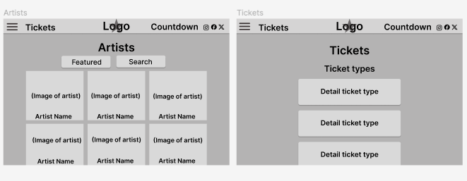
Thirdly I have the Artist website page, carrying on from the lineup page. Here I designed it to be squared photographs of each artist with their name over top. There will be a search button at the top for the user to look for any artist.
Then I curated the tickets page. I plan to have great details about the tickets and prices in the final layout. Including accessibility and VIP tickets as well as different day tickets.
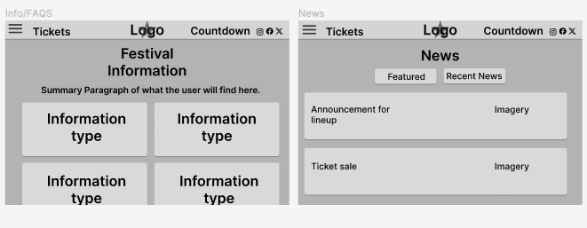
Next, we have the Information page, this will include all the information the attendees will need to feel they understand and know what to do and expect from the Wonderless music festival. This will involve essential, tickets, accessibility, food and drink, camping, hotel, and location information. the FAQS section will be on this page swell as you scroll to the bottom of the page.
Finally, I have included a News page. Originally I didn’t include a news page in my layouts. However, it encourages user engagement and keeps them updated on everything that is going on with the festival. Here I will have lineup updates and any other news.
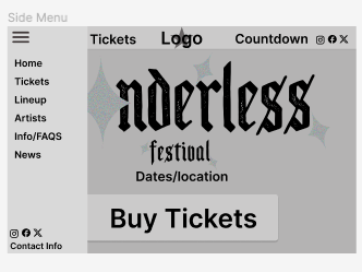
Finally, I have created what the side menu will look like and what it will include. I have every single page on there along with the social media and contact information at the bottom. I designed it so the background will go slightly darker than the menu making it clear to the user that it’s in use. I chose a sidebar over a top bar menu as it’s more user-friendly and easier to scale down for a responsive layout.
Responsive Layout
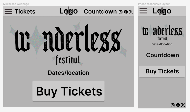
This is a basic example of my responsive layouts. The first window is a minimised version of the website, this includes all the same information just squashed down. The second window is the website on a phone screen. For this one, I have moved the countdown so the user can see it more clearly and moved the social media links to the bottom of the screen.