Task 1
In this presentation, I will introduce two influential posters from 1941 by Lester Beall and highlight their significant impact on society at the time. Both of these posters were designed as part of a series to promote the New Deal program that aimed to bring electricity to rural parts of the United States.
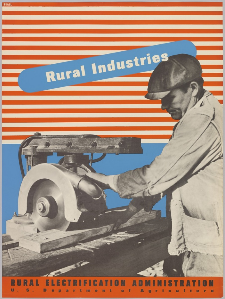
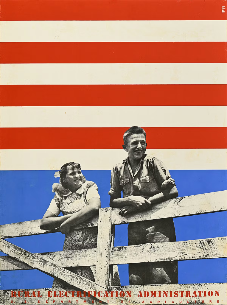
Beall’s style was a mix of modernism and Bauhaus; he used striking colours (usually primary colours) and bold lines. His designs hold up today and don’t look like old-fashioned posters. In both designs, the symbolism of the American flag is used in the background, highlighting the flag’s main elements, such as the red and white stripes and the deep blue. Without actually placing the flag, Beall designed it in his own way while ensuring it remained recognisable. This design choice links the posters and the promotion of the new deal to patriotism, suggesting that support for the deal is equivalent to supporting the country. Fabricating a feeling of trust and nationalism in the campaign for the American people.
The process used for Lester Beall’s artworks was screen-printing and photomontage, a blend of block colours and realism that created a distinct style. For the first poster, he’s overlaid a cut-out photograph of a man and woman leaning against a fence, both dressed as farmers. The people’s appearance is happy, confident, and hopeful, promoting a positive message for this deal after the United States had gone through the Great Depression. Bringing hope to the American people. The other poster showcases just one man at work; Beall is presenting not only the farmers in this deal but also the people who work beyond the farms. This creates a strong connection with his audience, as most Americans lived in rural areas and had similar jobs. Showing this off in a poster makes it feel more real to the audience. He advertised the average American.
The use of a black-and-white image layered on top of these block colours creates strong contrast, making the poster much more dramatic. Beall designed the campaign posters to be bold but easy to digest and understand. The two posters address two major concerns for the American people at that time: patriotism and the promotion of ordinary rural people expressing hope. The message is simple: Beall chose not to overload and confuse the design.
There’s limited text in the posters, both state “Rural Electrication Administration” at the bottom to make the message clear. The second poster features text in the design that declares “rural industries” to showcase the working people of America. The option to restrict text was to connect with his audience without words, through emotion. This built a stronger connection with his audience during a national hard time.
In conclusion, graphic design can make a real difference in society by changing how people think and feel about important issues. By using clear images, simple layouts, and strong colours, designers can convey messages that are easy to understand and emotionally connect with. As shown by Lester Beall’s work, good design can build trust, give people hope, and encourage them to support positive change. When used effectively, graphic design can help bring people together, raise awareness, and improve lives.
Task 2
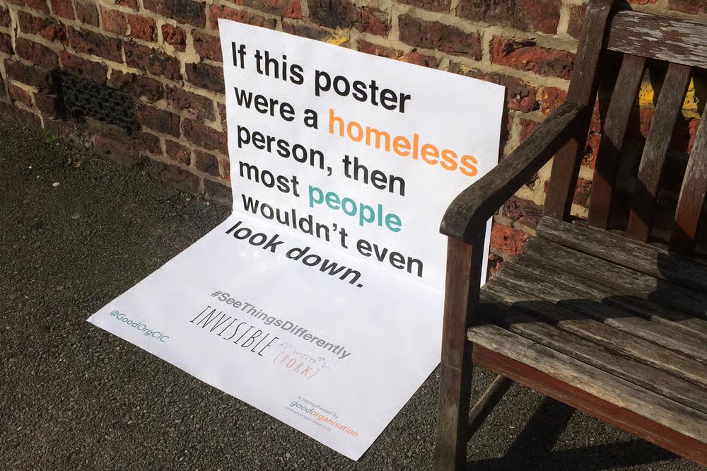
Good Organisation, Invisible York ,Kenny Lieske
An influential contemporary example of graphic design for social good is the Invisible York homelessness awareness campaign, based in York and set up by Good Organisation. This poster uses site-specific typography and spatial design to confront the public with their views and opinions on homelessness. The poster shown, placed next to a bench and folded onto the pavement, reads: “If this poster were a homeless person, then most people wouldn’t even look down.” This intervention demonstrates how contemporary graphic communication can shift public views and foster empathy through both poster placement and conceptual design.
This campaign is using a type-led strategy that transforms everyday outdoor furniture into a message. Rather than relying on traditional billboards or poster placements, the designers embed the message directly into public space. The poster’s vertical and horizontal layout mimics the physical position of a homeless person sitting or lying on the street. By forcing viewers to look down to read the full message, the design immediately makes people second-guess themselves and their opinions on homeless people. Making people self-reflect.
Typographically, the poster uses a clean sans-serif font with little colour emphasis. Words such as “homeless” and “people” are highlighted, drawing attention to the message. The restrained palette forces the audience to read the message, reinforcing the campaign’s seriousness.
This poster showcases how social media has a significant impact on the spread of the campaign’s message, as images of the posters are shared all over the internet. While the posters are in public spaces, images of them are widely shared on social media. This extends the campaign’s reach beyond York, allowing the message to circulate nationally and internationally. The design’s visual simplicity makes it highly shareable. This way, the campaign leverages social media to spread a locally rooted intervention.
The Invisible York campaign contributes to a wider social shift in how people discuss and perceive homelessness. Similar to national initiatives led by organisations such as Shelter and Crisis, it reframes homelessness as a social responsibility rather than an individual failure. However, unlike large-scale charity advertising, this campaign works through subtle sharing rather than emotional shock. Its power lies in its physical placement, which makes it visible to the audience.
The campaign succeeds because it makes the viewers responsible rather than passive observers. By physically positioning the message at ground level, it requires people to move physically. The viewer is not simply told to care; they are placed in a moment of social self-awareness.
In conclusion, the Invisible York campaign shows how graphic design can make a real difference by using clear text, smart placement, and online sharing. By combining posters in public spaces with digital media, the campaign challenges people to think differently and care more about homelessness. It shows that even simple, low-cost designs can change how people see important social issues when the message and setting work well together.
Task 3
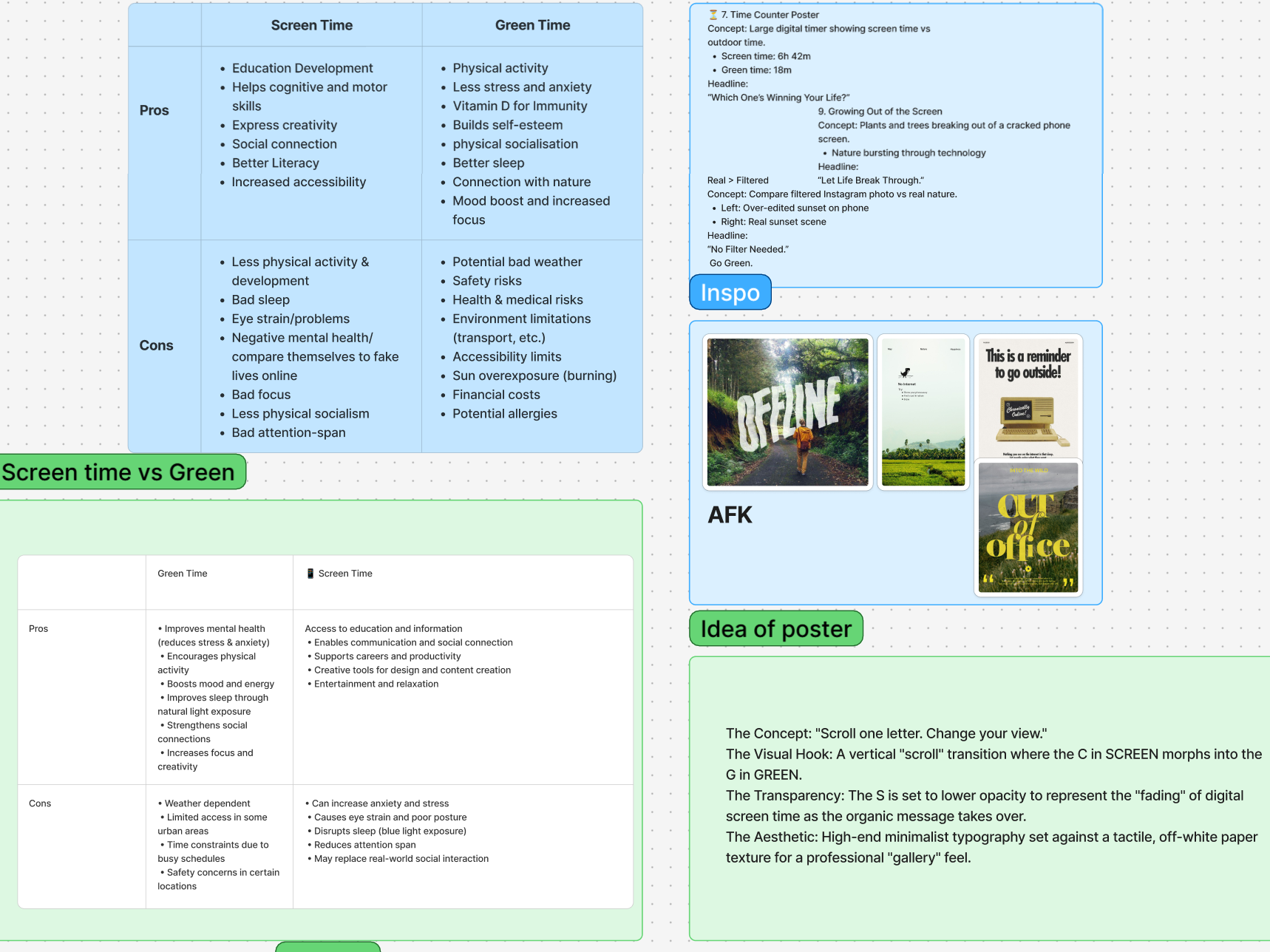
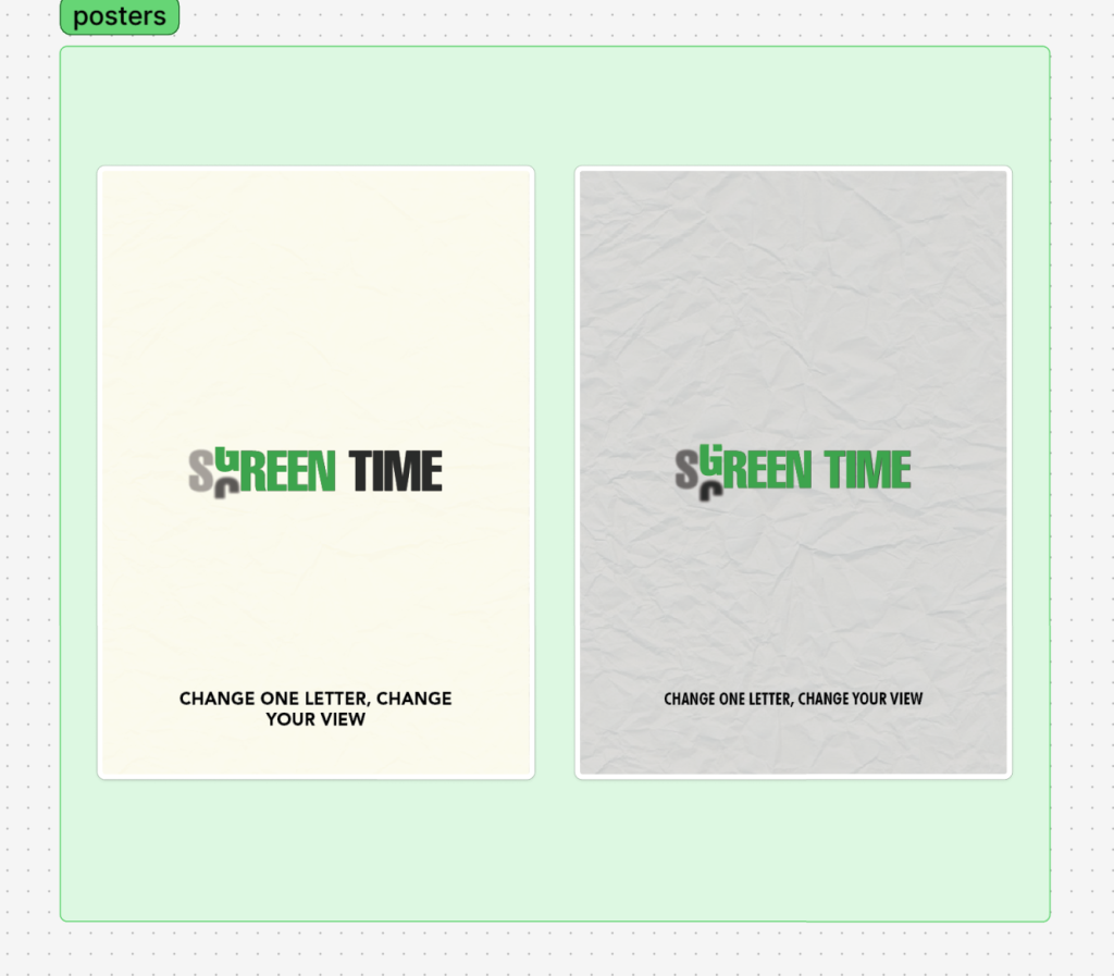
Below, I have attached a link to my group’s Figjam board to see our progress on the Green time vs Screen time campaign. We chose the audience of 14-29 year olds.
https://www.figma.com/board/XS4Rb3pFbOvQxFFgilomYj/Task-3?node-id=0-1&t=Qneh2DK8zNKaxacc-1
Task 4
Below, I have attached a PDF of my major project proposal presentation. I reduced the slides slightly because the PDF was too large to upload. My major project subject is fast fashion and its impact on the environment and society.