In this section, I will be showcasing my mood boards, colour planning and typography. The theme of my music festival is indie rock, so the style and colours follow this theme.
Moodboards
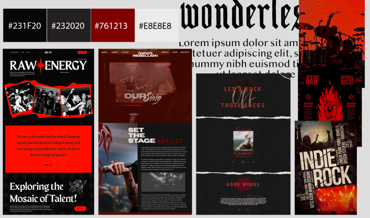
This mood board I created for the website design, focuses on a darker tone and this is where I decided red would be the festival’s primary colour. The example websites shown here, help express my style and layout better. On the right of the board, I added illustrations of the style I will take inspiration from for my website design.
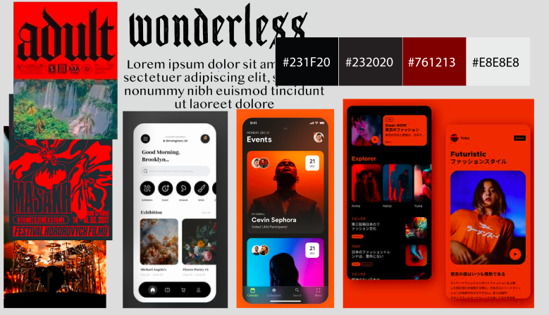
I’ve done a similar mood board for the app design here. In the example app designs, The curved squares give a seamless feel and minimalist look. This mood board expresses the colour, style and layout I will achieve with my festival app. Adding illustrations of the art style I will take inspiration from gives me a better idea of how to incorporate it and what I want the final app design to look like.
Typography
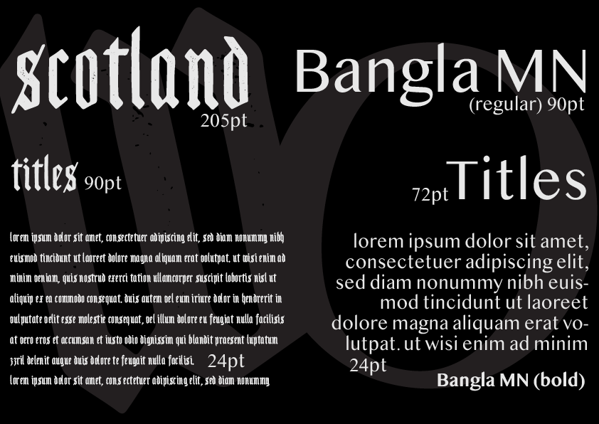
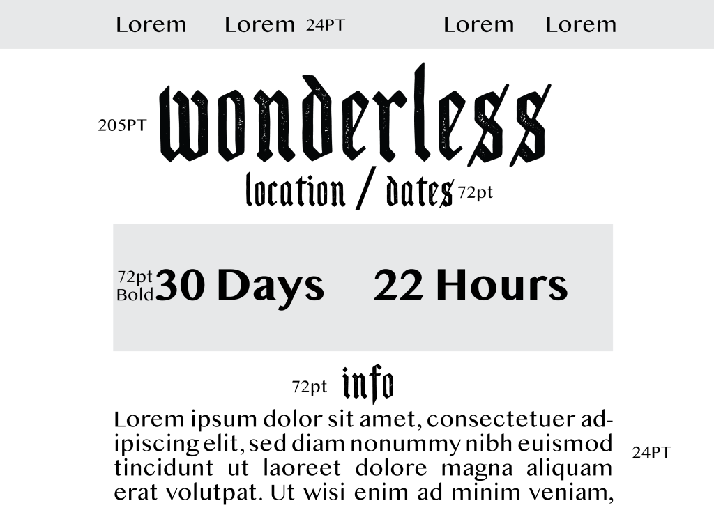
The image above showcases the two fonts that will be used for the Wonderless festival app and website.
The first font “Scotland” is a blackletter typeface. I chose this font to be more of the headliner because of how different it is, it adds a more grunge and sombre vibe, which I am aiming for this indie rock festival. Scotland can only be used for titles and logos. This is because the letters are a lot smaller and closer together making it very unreadable in a paragraph. The Secondary type face is Bangla MN, this will be used for paragraph writing as it is a very easy-to-read font. The bold version will be utilised in my app and website design as well.
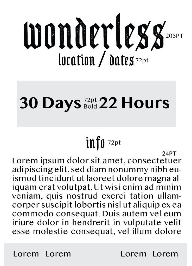
Below I have displayed how the fonts will be potentially used in the app and website design.
Colour Planning
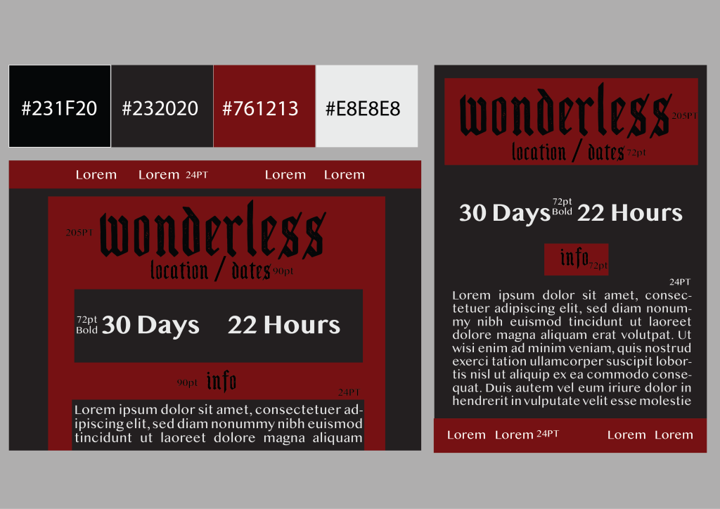
For the Wonderless Festival colour palette, I have picked 4 colours altogether with a deep red being the primary colour. The other three tones are black, grey and white. Choosing these will bring out that grunge and dark mood to the style of the brand while making the app and website as readable as possible. Having dark grey as the background may be risky for those who are colour-blind, however using a white font in a very readable typeface will combat this struggle. The one bright tone (white) balances out the whole style, adding that contrast. The example I have curated expresses the basic idea of how I’ll utilise these colours together. The use of images will help these tones and the style come together much better.