For this post, I focused on developing my app’s design with the user experience in mind. I’ve done this by looking at competitors’ apps, doing online research into the UX of apps and constructing my survey to get real-people feedback.
First I look into my competitors. I’ve fabricated a chart of each page of the apps to see what they do right and what I can improve upon. I found that festival apps aren’t that popular and are very hit-and-miss. Some of these apps don’t offer anything new to the user compared to their website, rendering them useless. Not including customisation like a schedule or map will avoid this outcome.
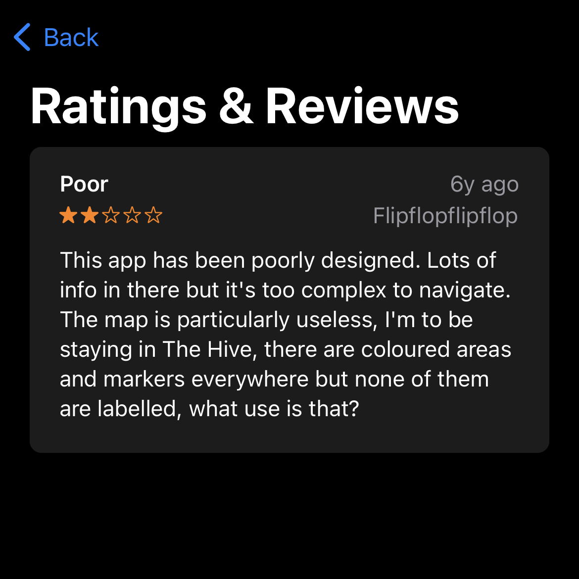
Involving a favourite feature in the app for each artist the user is interested in, is a concept I’m going to create. These favourites will end up in the consumer’s schedule list so they can see when and where their favourite artists are playing. Fabricating a seamless and useful map is also a very important feature, including everything the user will need on the map and their distance from it.
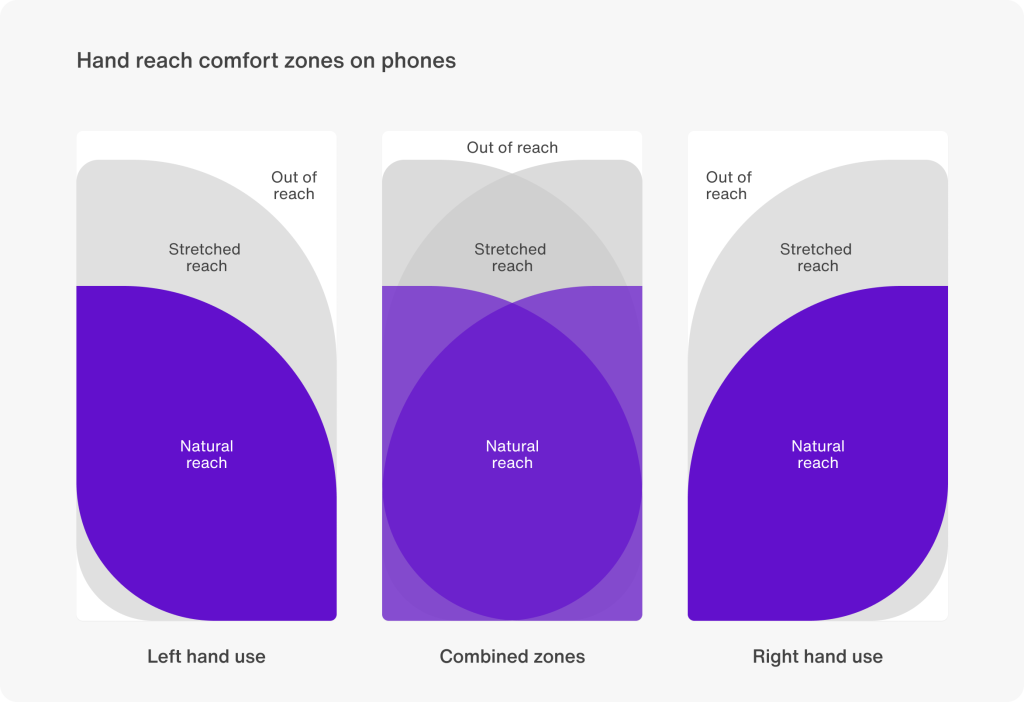
Secondly, a vital decision is the menu type and placement. Curating a user-friendly app, I will design the menu at the bottom of the screen, indicated by icons and text. I chose this menu because it is the easiest area for users to tap on their phones in any holding position. Compared to being at the top of the screen can be a bit of a stretch especially when you’re out and about at a festival. I will take into consideration the button sizes and spacing between them, making it so consumers can tap with ease.
The last piece of my research centres around my survey responses. This is a UX-focused survey that got 21 respondents.
The first question is to understand how prevalent festival apps are. I asked the survey-takers if they’ve ever used a music festival app. The results came back 50/50. This shows me a big chunk of users don’t know how to use a festival app and may need help with it. Including onboarding for new users will guide the users.

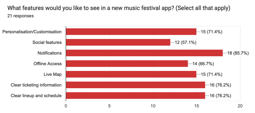
for the fourth question, I asked what features the participants would like to see in the app. Notification got the most votes with 85%, reinforcing the importance of asking for permissions at the beginning of the app like push0notifications. This keeps the users engaged. Ticketing and lineup/schedule had 76% of the vote. The least voted-for feature was a social feature with 57%, letting me know not to focus on the social aspect too much.
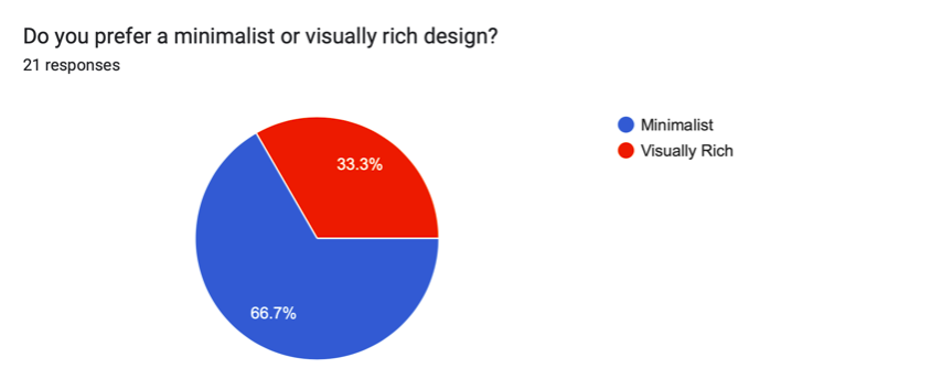
For the style of the app, I wanted to go down the minimalist route. So I asked the survey-takers if they preferred a visually rich or minimalist design in an app. Minimalist style got the vote with 66% reinforcing my idea of minimalism being more user-friendly.
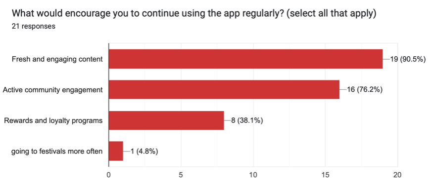
For the second to last question, I asked the percipients what features would motivate the user to keep using the app. Fresh and engaging content got 90% and community engagement got 76%. Rewards and loyalty got the least amount of votes with 38%. I won’t be including the loyalty idea, especially with the function of the app, it doesn’t make sense to have that feature.
Overall, I have developed the layout and the features I will include in my festival app. I’ve discovered what’s important for the user experience and what should be the app’s priority.
Figjam Artboard
Refrences
Shweta Joshi (2024) Top 20 must-know mobile app UX best practices. Available online: https://sendbird.com/blog/mobile-app-ux-best-practices [1/4/24]
Live Nation Festivals nv (2016) Rock Werchter. (14.0.2) [Mobile app]. Available at: Apple App Store (Downloaded: Date of download).