For this post, I will be presenting my Mid-fidelity app layout for my music festival. I have added a basic version of my onboarding for the app as well.
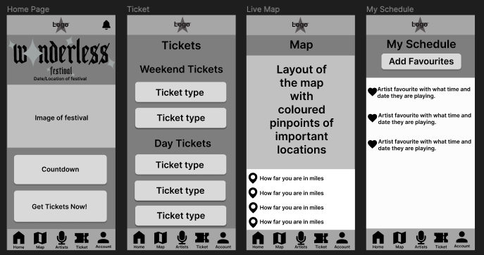
Above I have the first four pages of my festival app and will go through them one by one. Firstly for the consistent layout, I have chosen to have just a bottom menu bar. This includes icons with text underneath to let the user know what page those icon buttons will take them. At the top, I have the same bar but it’ll only consist of the logo, this is just to keep the app looking tidy. The home page has a notification button that will take the user to the notification page.
The Home page Has the Wonderless logo displayed similar to the website home page. I will include imagery of the festival below it for more interactivity for the user. Then the countdown for the festival date and a call-to-action button for the festival tickets.
Next is the ticket page, here the consumer can look at all the ticket types (this will include VIP, day, weekend, camping and accessibility tickets) and information.
Thirdly, I have created a map page. On this page, the user will have a live map that will have their exact location if they allow the app to have access to their location. I have added a bar at the bottom that will show have far the user is from different marked locations on the map. The map design will include different coloured pinpoints that represent different locations like toilets, food, drink, stages, perch stands, etc.
Next is the Schedule page. Users will have the option to favourite different artists on the artist page by clicking the heart on their image. This will move the hearted artist to this page which will showcase where and what time that artist is on at the festival.
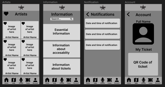
For the next row of my mid-fidelity layouts, I have started with the Artists page.
For the Artists page, I have the hearted aspect that I’ve added. The user has the navigation button at the bottom of the page to get to this artist page. However, to get to their schedule page they will need to click on the big heart icon bottom at the top of the screen. I have laid out all the artists with a favourite button, Each artist will have their name and an image of them.
Next, I have the information page. Here will include all the same information as I will on the website page, including food, drink, essentials, tickets, camping, accessibility information and more. A FAQS section will be on the page after the information section. I’ve added a search bar for users to look for the exact information that they want.
Following is the Notification page. Here the user will get a notification from the app on their phone and they’ll stay here for future reference. These notifications include news updates on the lineup, ticket information and anything else that’s going on in the festival. This keeps the user’s engagement up.
Finally is the Account page for the consumer. Here they can either log in or sign up. When signed in their name will be displayed and if they have bought a ticket, a QR code will be displayed below their user icon. This QR code will be used at the gates of the festival to get in.
App Onboarding
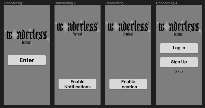
Above I have designed four onboarding pages for my festival app. The notification permission and location permission are essential to get the most out of the app. Giving the user notifications and use of the live map. The last portion of the onboarding will be a login or sign-up screen. They can skip this but have made that option much harder for the user to find so they are better encouraged to sign up.