In this post, I’ll be discussing the teamwork we did in class. There are two teams I worked with for this exercise. The Research was focused on charities websites and social media.
WWF Website
The first group session focused on the World Wildlife Fund (WWF), a popular charity. I was placed in a group of four and decided me and Jess would explore the user experience of their website, while Karla and Noah would inspect the social media. Our analysis is displayed on a canvas board on Padlet, which I’ll link below.
https://padlet.com/klamot2022/canvas-u3sfxb974bvdssky
The purpose of a non-profit organizations website should be understandable and clear, including guidance on how users can support it. The Website link opens with a bold “adopt an animal now” title, followed by a short description of how to do so. With call-to-action buttons placed tactically in the top right with colour.
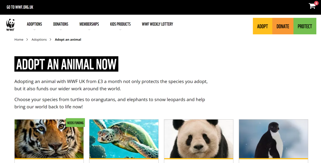
This is emphasized by the black-and-white contrast of the WWF website. This gives the user direction on where to click or scroll next. However, this page they have directed us to isn’t the homepage. WFF has done this to push the audience to donate quickly. The user can easily get to the homepage by clicking the top left corner. In their About Us tab they showcase all their values and mission statement. Across all campaigns, WWF’s mission stays true from social media to posters.
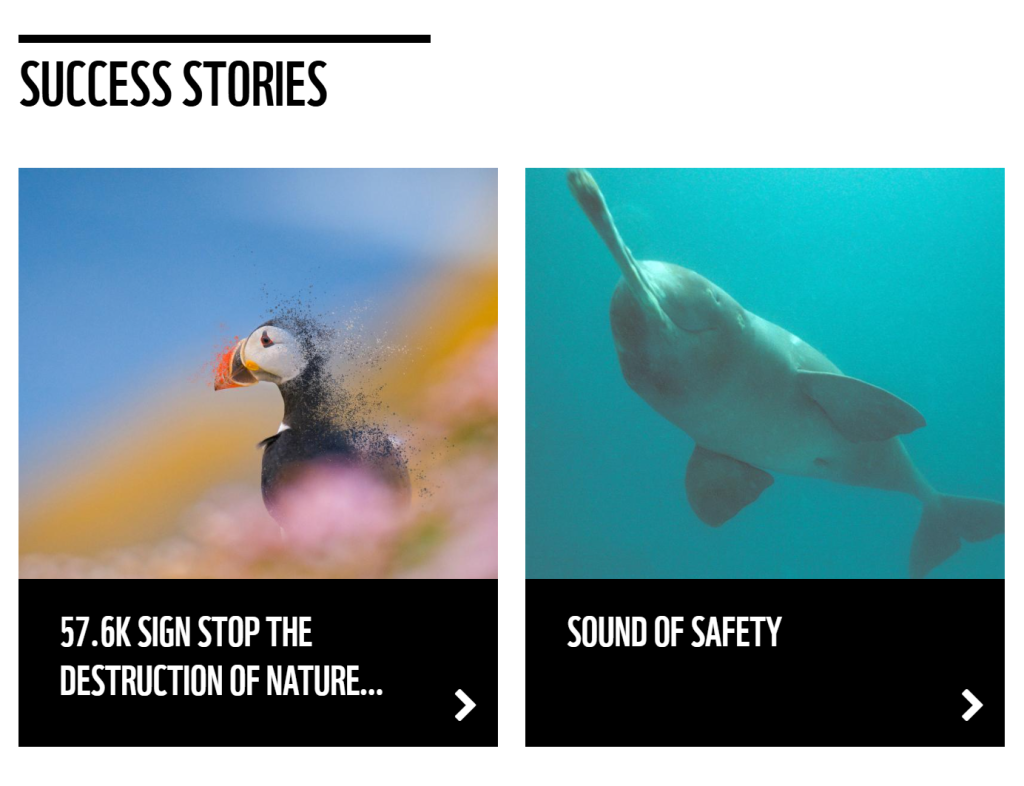
The messaging across the website and campaigns is urgent and assertive. The site uses phrasing like “Take Action” and “Your World” making the potential donor feel responsible and like they can make a change for “their world”. The website has lots of keywords like this. This pushes their mission to the audience. Including these keywords helps the website’s SEO as well. The website promotes success stories on the homepage, including new legislation to protect forests and case studies. This builds great trust with donors as they see where their Donations end up.
The World Wildlife Fund’s website has a simple layout and design packed with easy-to-digest information. After evaluating the website together. The site uses a horizontal menu setup with drop-down boxes. It’s easy to navigate but so much content confuses the user. My team recognized it was difficult to go back to where they started. This can be combated by simplifying their site with less content and pages.
The site is responsive on all devices and very responsive when you shrink the screen.
There are no accessibility options/tabs on the WWF website but the design has accessibility in mind. There is a great contrast in colour for text as the primary colours are black and white. Not much colour is used so those who are colour-blind won’t have a problem. The simple capitalized font that’s enlarged helps anyone who struggles to see the writing. They also have subtitles on videos. These features follow the WCAG guidelines.
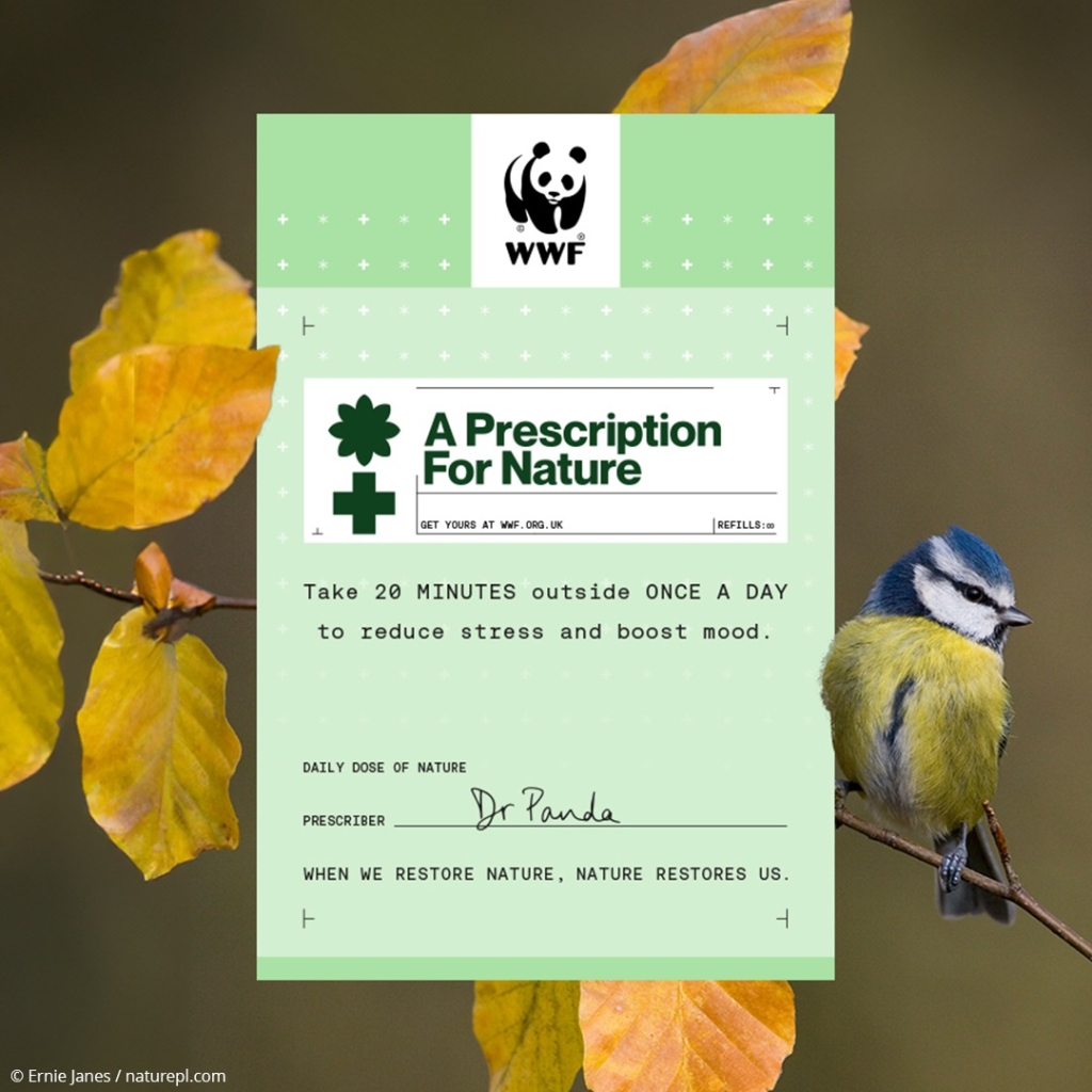
All the imagery and visuals are authentic to WWF’s mission. They use blue, green, yellow, red and orange as their secondary colours, following the nature theme. For the imagery and videos, they add a small citation in the corner of each, showing their transparency. This gains the trust of the audience. Most of the imagery provokes hope from the viewers but for some urgency.
The group found the social media at the bottom of the WWF website. Exploring these platforms we find they post many videos and photographs of their work, creating a connection with the target audience. They even have an app.
The website is big on sustainability. Their videos don’t play unless you click them, saving on energy used on the website. They have a user privacy and data section at the bottom of their website. This showcases what they do with the data and why and that your privacy is safe.
Timebank Website
The second portion of group work was on a smaller and local charity called Timebank. The group consisted of 3 people, me, Holly and Rediate. Again we worked on a canvas board and discussed important points about Timebank’s website.
https://padlet.com/awaudby2022/timebank-mcxp5h63zhaijx6
Everyone in the group found Timebank’s mission and purpose aren’t clear on the site. There’s also no guidance for the user on what to explore next. Our team wasn’t sure what the charity’s does and how it works from the website alone. There’s a small description of the history of the charity and that it’s a volunteering organization. The page had zero call-to-action buttons as well.
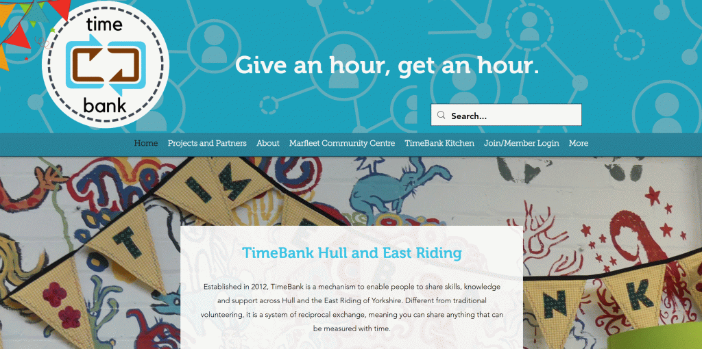
The team found the tone of the site generic and basic, nothing jumps out and engages with the audience. They do include two testimonies on the site to showcase their work. The site menu includes the “TimeBank Kitchen” and “Marfleet Community Centre” where they give to the people.
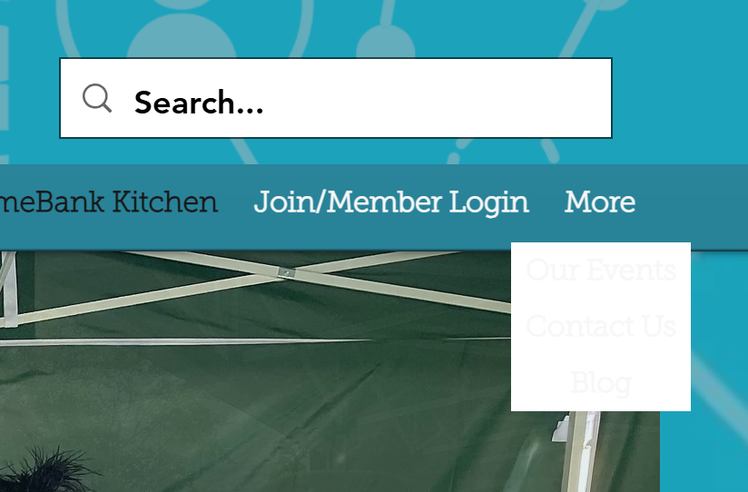
The overall website is easy to navigate mostly but lacks content. There is not much for the user to engage with and not many call-to-action buttons. There is no responsive layout when you make a screen smaller, but they made a layout for phone sizes. The slogan they placed at the top is great but doesn’t have an impact because of its design, lacking an impactful font and size. There are no accessibility options and the site doesn’t follow the WCAG principles. The paragraphs of text are too small and setting it in front of images makes it difficult to read. The choice of font makes the text too thin and hard to digest as well. The videos have no subtitles either. All these points can be easily adjusted to create good accessibility for anyone.
Timebak’s colours are blue, white and brown. These colours remind me of a river which plays into the location of this charity. However, I don’t understand how they connect to their purpose. The photographs and videos included on their site are very authentic creating a more real feel to the charity, strengthens trust with the audience. The images create a feeling of community, one of the organization’s aims.
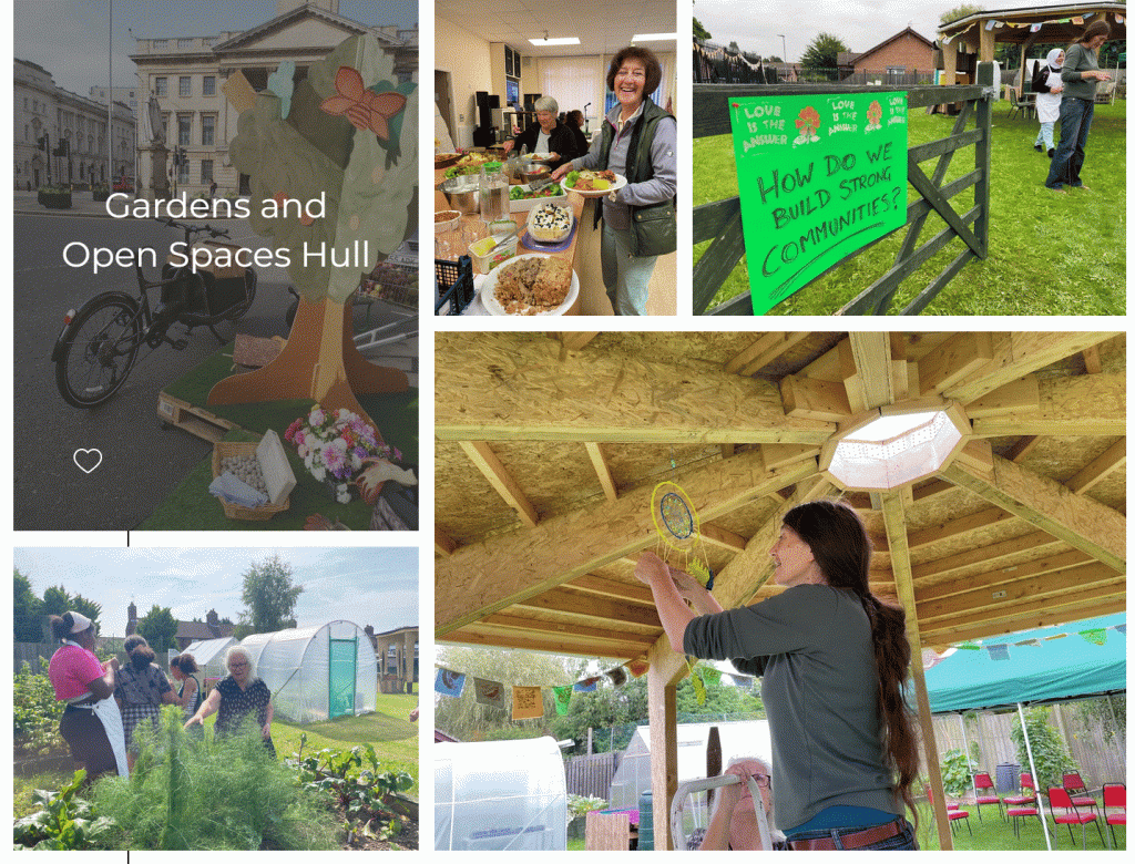
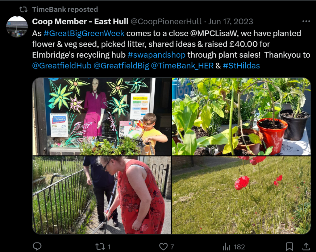
The social media of Timebank is much more engaging than the site. They post often about any event they are hosting and give great insight into what they have to offer. On social media, mainly Facebook, many members are sharing their experiences with Timebank. This adds trust and credibility to the charity from an outsider’s view. On their website, timebank showcases all the partnerships and projects they formed since they started. Showing their impact on the community.
Reflection
In reflection on both these websites, in my group we found wording and calls to action are very important in making a good charity site. By using some of WWF’s website features, Timebank’s site can become far more impactful.
References
WWF (2024) homepage*. https://www.wwf.org.uk/ [28/10/24].
WWF UK (2024) The UK’s mental health is in decline [Facebook]. 4 October. https://www.facebook.com/photo?fbid=952329066933027&set=a.385056900326916&locale=en_GB [28/10/24].
Timebank Hull and East Riding (2022) homepage*. https://www.timebankhullandeastriding.co.uk/ [28/10/24].
Coop Member – East Hull (2023) As #GreatBigGreenWeek comes to a close @MPCLisaW, we have planted flower & veg seed, picked litter, shared ideas & raised £40.00 for Elmbridge’s recycling hub #swapandshop through plant sales! Thankyou to @GreatfieldHub@GreatfieldBig@TimeBank_HER & #StHildas. [X]. 17 June. https://x.com/CoopPioneerHull/status/1670082291928891400 [28/10/24].