For this post, I’ll be analysing current web design approaches and how they may help in my future design. Also, explain my experience with these approaches in past designs.
Grid Systems
Grids are used in website design to create a guide. They help fabricate visual hierarchy, easy navigation, and an aesthetically pleasing look.
These guides build balance, symmetry, and uniformity in your web design. Grids aid in consistency for each page and on different devices, providing a much better user experience.
There are many different grids to use for website design. I” be showcasing two that are more common and that I may use for my design:
Column Grids

These grids consist of vertical column divisions on the page, with an even width to fit content proportionally in each row. The vertical dividers are called gutters and should be the same width as the columns. Gutters fabricate space so the user can distinguish between different content.
Hierarchical Grids
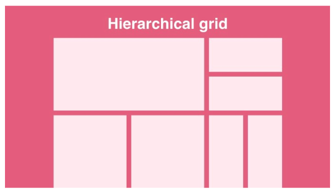
This Grid type is more flexible and helps organise content in order of importance. Hierarchical grids divide the page into columns and rows.
I haven’t used grids in any of my website designs so far. I can see how it would aid immensely in page and device consistency so plan to use the column grid for this project.
Responsive Design
Responsive design is the conversion of different screen sizes on diverse devices. Keeping the same layout design but shrinking or expanding it to fit different screen sizes. This is different from adaptive design where you fabricate different layouts for a varied amount of screens.
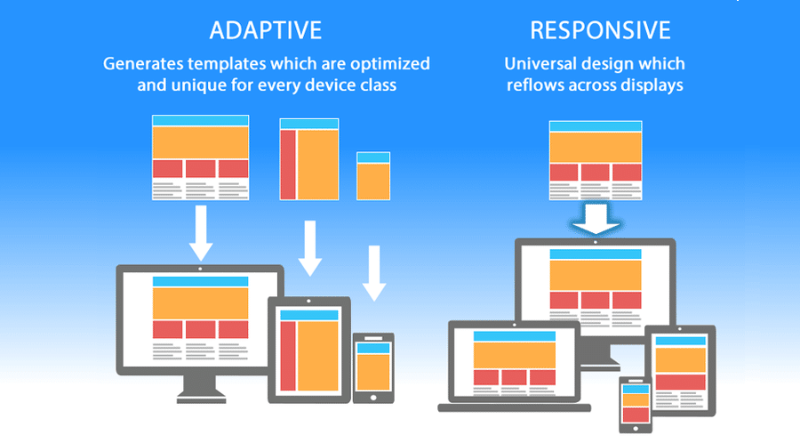
However, the mobile web has now overtaken the desktop, making designers focus on the mobile design first and making it responsive for bigger devices. This showcases how important it is that your website layout is consistent and works across all screens.
I have created responsive designs in the past as it’s important for the site to work on all devices. I will focus on this in my next web design as well.
Navigation
Websites need clear navigation to guide the user through the site seamlessly. Including a simple menu with drop-down boxes on the desktop or a side menu for phones advises the users on an easy way to find everything on the site faster. The main features of a website should be highlighted to the audience and work across all devices.
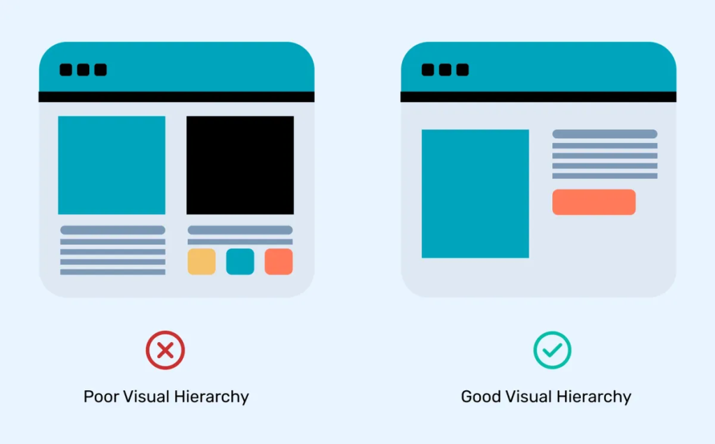
Visual Hierarchy
Fabricating an understandable hierarchy of content on each webpage aids the users on where to go next. Creating a logical site.
Features like a clear and bold header, direct menu and call-to-action buttons, fabricate hierarchy in web design. These features’ location is important, placing them at the top of the page is vital as that is where users will see them first.
This design approach is too important to miss out and will be including it in my next web design.
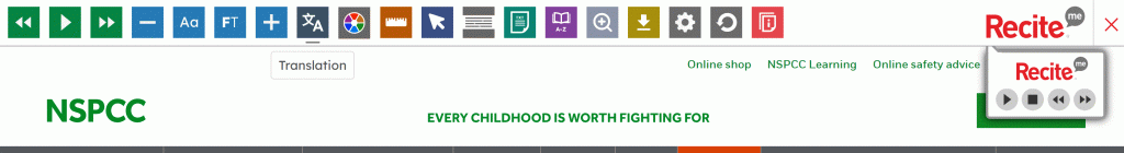
Accessibility
An accessibility-friendly website is essential to create a great user experience, keeping all users in mind. The choice of colours, contrast, Font and text size all come into play for an accessible site.
Taking into consideration people who have bad vision, dyslexia, colour blindness or even attention deficit aids in branching out for a friendlier website design. The World Health Organization estimates that 1.3 billion people, or 16% of the world population, experience significant disability (Andy Parker, May 13 2024, Important Accessibility Statistics to Know). Showcasing the importance of accessibility in websites.
Testing that your text is easy to read, the colours used are colour-blind friendly and incorporate white space, short paragraphs and simple screen images. Adding captions to videos for users who are deaf and including a screen reader for those who are blind. Finally, make sure your website can be used just from a keyboard who users who can’t use a mouse. Will help all users to enjoy your site. This helps keep your website within the WCAG guidelines.
To take it a step further, you can add extra accessibility options as a menu item. This can include making the site have a white or black background (dark mode) or making the text bigger. The user would just adjust these options to their liking.
Personally, I have followed the WCAG guidelines for web design in the past but I want to incorporate an accessibility option as well in my future design.
Call To Action
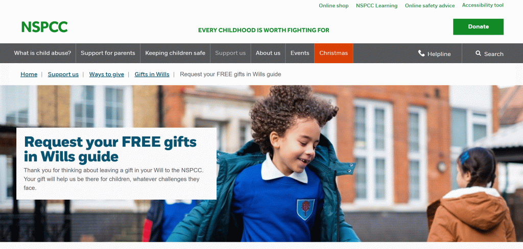
Call-to-action buttons should shout for the user to click them. You can do this by creating a button that stands out from the rest of the website design with shape, colour or size. These are great for charity sites that can use these buttons for donations and other important aspects.
Call to action buttons are vital for charity so I will be using them as they are very effective.
References
Jaye Hannah (2023) How to Use Grids in Web Design [Blog post]. UX Design Institute. 11 April. https://www.uxdesigninstitute.com/blog/how-to-use-grids-in-web-design/ [5/11/24].
Nitish Khagwal (2020) Responsive Grid Design: Ultimate Guide [Blog post]. Medium. 23 October. https://medium.com/@nitishkmrk/responsive-grid-design-ultimate-guide-7aa41ca7892 [5/11/24].
Matteo Duo (2020) The Beginner’s Guide to Responsive Web Design (Code Samples & Layout Examples) [Blog post]. Kinsta. 14 September. https://kinsta.com/blog/responsive-web-design/ [5/11/24].
Nicole Singh (Undated) 20 web design principles to follow*. https://www.canva.com/learn/20-web-design-principles-follow/ [5/11/24]
Stephanie Corrigan (Undated) 7 Website Navigation Best Practices With Examples*. https://www.flux-academy.com/blog/7-website-navigation-best-practices-with-examples [5/11/24].
Prince Pal (2022) Visual Hierachy [Blog post]. Think360. 22 December. https://think360studio.com/blog/visual-hierarchy [5/11/24].
Andy Parker (2024) Important Accessibility Statistics to Know [Blog post]. Acquia. 24 May. https://www.acquia.com/blog/accessibility-statisticsy [5/11/24].
NSPCC (Undated) Homepage*. https://www.nspcc.org.uk/support-us/ways-to-give/leave-charity-gift-in-will/form/?utm_source=google&utm_medium=cpc&utm_campaign=legacy&utm_id=243108&utm_content=brand&gad_source=1&gclid=Cj0KCQiAoae5BhCNARIsADVLzZctF6h7O9cq8K-wSeQXb2H_tqbzr9aNNo897aLMd6BIFJe4pXZn1n8aAvhjEALw_wcB&gclsrc=aw.ds [5/11/24].
RedCross (Undated) Homepage*. https://www.redcross.org.uk/ [5/11/24].